Hot on the heels of delving into the world of R frequency table tools, it’s now time to expand the scope and think about data summary functions in general. One of the first steps analysts should perform when working with a new dataset is to review its contents and shape.
How many records are there? What fields exist? Of which type? Is there missing data? Is the data in a reasonable range? What sort of distribution does it have? Whilst I am a huge fan of data exploration via visualisation, running a summary statistical function over the whole dataset is a great first step to understanding what you have, and whether it’s valid and/or useful.
So, in the usual format, what would I like my data summarisation tool to do in an ideal world? You may note some copy and paste from my previous post. I like consistency 🙂
- Provide a count of how many observations (records) there are.
- Show the number, names and types of the fields.
- Be able to provide info on as many types of fields as possible (numeric, categorical, character, etc.).
- Produce appropriate summary stats depending on the data type. For example, if you have a continuous numeric field, you might want to know the mean. But a “mean” of an unordered categorical field makes no sense.
- Deal with missing data transparently. It is often important to know how many of your observations are missing. Other times, you might only care about the statistics derived from those which are not missing.
- For numeric data, produce at least these types of summary stats. And not to produce too many more esoteric ones, cluttering up the screen. Of course, what I regard as esoteric may be very different to what you would.
- Mean
- Median
- Range
- Some measure of variability, probably standard deviation.
- Optionally, some key percentiles
- Also optionally, some measures of skew, kurtosis etc.
- For categorical data, produce at least these types of summary stats:
- Count of distinct categories
- A list of the categories – perhaps restricted to the most popular if there are a high number.
- Some indication as to the distribution – e.g. does the most popular category contain 10% or 99% of the data?
- Be able to summarise a single field or all the fields in a particular dataframe at once, depending on user preference.
- Ideally, optionally be able to summarise by group, where group is typically some categorical variable. For example, maybe I want to see a summary of the mean average score in a test, split by whether the test taker was male or female.
- If an external library, then be on CRAN or some other well supported network so I can be reasonably confident the library won’t vanish, given how often I want to use it.
- Output data in a “tidy” but human-readable format. Being a big fan of the tidyverse, it’d be great if I could pipe the results directly into ggplot, dplyr, or similar, for some quick plots and manipulations. Other times, if working interactively, I’d like to be able to see the key results at a glance in the R console, without having to use further coding.
- Work with “kable” from the Knitr package, or similar table output tools. I often use R markdown and would like the ability to show the summary statistics output in reasonably presentable manner.
- Have a sensible set of defaults (aka facilitate my laziness).
What’s in base R?
The obvious place to look is the “summary” command.
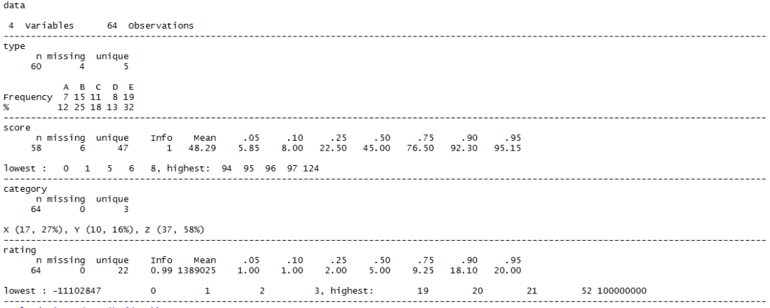
This is the output, when run on a very simple data file consisting of two categorical (“type”, “category”) and two numeric (“score”, “rating”) fields. Both type and score have some missing data. The others do not. Rating has a both one particularly high and one particularly low outlier.
summary(data)

This isn’t too terrible at all.
It clearly shows we have 4 fields, and it has determined that type and category are categorical, hence displaying the distribution of counts per category. It works out that score and rating are numerical, so gives a different, sensible, summary.
It highlights which fields have missing data. But it doesn’t show the overall count of records, although you could manually work it out by summing up the counts in the categorical variables (but why would you want to?). There’s no standard deviation. And whilst it’s OK to read interactively, it is definitely not “tidy”, pipeable or kable-compatible.
Just as with many other commands, analysing by groups could be done with the base R “by” command. But the output is “vertical”, making it hard to compare the same stats between groups at a glance, especially if there are a large number of categories. To determine the difference in means between category X and category Z in the below would be a lot easier if they were visually closer together. Especially if you had many more than 3 categories.
by(data, data$category, summary)

So, can we improve on that effort by using libraries that are not automatically installed as part of base R? I tested 5 options. Inevitably, there are many more possibilities, so please feel free to write in if you think I missed an even better one.
- describe, from the Hmisc package
- stat.desc from pastecs
- describe from psych
- skim from skimr
- descr and dfSummary from summarytools
Was there a winner from the point of view of fitting nicely to my personal preferences? I think so, although the choice may depend on your specific use-case.
For readability, compatibility with the tidyverse, and ability to use the resulting statistics downstream, I really like the skimr feature set. It also facilitates group comparisons better than most. This is my new favourite.
If you prefer to prioritise the visual quality of the output, at the expense of processing time and flexibility, dfSummary from summarytools is definitely worth a look. It’s a very pleasing way to see a summary of an entire dataset.
Update: thanks to Dominic who left a comment after having fixed the processing time issue very quickly in version 0.8.2
If you don’t enjoy either of those, you are probably fussy :). But for reference, Hmisc’s describe was my most-used variant before conducting this exploration.
describe, from the Hmisc package
library(Hmisc)
Hmisc::describe(data)
This clearly provides the count of variables and observations. It works well with both categorical and numerical data, giving appropriate summaries in each case, even adapting its output to take into account for instance how many categories exist in a given field. It shows how much data is missing, if any.
For numeric data, instead of giving the range as such, it shows the highest and lowest 5 entries. I actually like that a lot. It helps to show at a glance whether you have one weird outlier (e.g. a totals row that got accidentally included in the dataframe) or whether there are several values many standard deviations away from the mean. On the subject of deviations, there’s no specific variance or standard deviation value shown – although you can infer much about the distribution from the several percentiles it shows by default.
The output is nicely formatted and spacious for reading interactively, but isn’t tidy or kableable.
There’s no specific summary by group function although again you can pass this function into the by() command to have it run once per group, i.e. by(data, data$type, Hmisc::describe)
The output from that however is very “long” and in order of groups rather than variables naturally, rendering comparisons of the same stat between different groups quite challenging at a glimpse.
stat.desc, from the pastecs package
library(pastecs)
stat.desc(data)

The first thing to notice is that this only handles numeric variables, producing NA for the fields that are categorical. It does provide all the key stats and missingness info you would usually want for the numeric fields though, and it is great to see measures of uncertainty like confidence intervals and standard errors available. With other parameters you can also apply tests of normality.
It works well with kable. The output is fairly manipulable in terms of being tidy, although the measures show up as row labels as opposed to a true field. You get one column per variable, which may or may not be what you want if passing onwards for further analysis.
There’s no inbuilt group comparison function, although of course the by() function works with it, producing a list containing one copy of the above style of table for each group – again, great if you want to see a summary of a particular group, less great if you want to compare the same statistic across groups.
describe and describeBy, from the psych package
library(psych)
psych::describe(data)

OK, this is different! It has included all the numeric and categorical fields in its output, but the categorical fields show up, somewhat surprisingly if you’re new to the package, with the summary stats you’d normally associate with numeric fields. This is because the default behaviour is to recode categories as numbers, as described in the documentation:
…variables that are categorical or logical are converted to numeric and then described. These variables are marked with an * in the row name…Note that in the case of categories or factors, the numerical ordering is not necessarily the one expected. For instance, if education is coded “high school”, “some college” , “finished college”, then the default coding will lead to these as values of 2, 3, 1. Thus, statistics for those variables marked with * should be interpreted cautiously (if at all).
As the docs indicate, this can be risky! It is certainly risky if you are not expecting it :). I don’t generally have use-cases where I want this to happen automatically, but if you did, and you were very careful how you named your categories, it could be handy for you.
For the genuinely numeric data though, you get most of the key statistics and a few nice extras. It does not indicate where data is missing though.
The output works with kable, and is pretty tidy, outside of the common issue of using rownames to represent the variable the statistics are summarising, if we are being pernickety.
This command does have a specific summary-by-group variation, describeBy. Here’s how we’d use it if we want the stats for each “type” in my dataset, A – E.
psych::describeBy(data, data$type)

Everything you need is there, subject to the limitations of the basic describe(). It’s much more compact than using the by() command on some of the other summary tools, but it’s still not super easy to compare the same stat across groups visually. It also does not work with kable and is not tidy.
The “mat” parameter does allow you to produce a matrix output of the above.
psych::describeBy(data, data$type, mat = TRUE)

This is visually less pleasant, but it does enable you to produce a potentially useful dataframe, which you could tidy up or use to produce group comparisons downstream, if you don’t mind a little bit of post-processing.
skim, from the skimr package
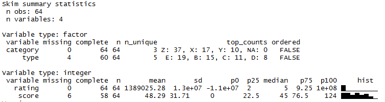
library(skimr)
skim(data)

At the top skim clearly summarises the record and variable count. It is adept at handling both categorical and numeric data. For readability, I like the way it separates them into different sections dependent on data type, which makes for quick interpretation given that different summary stats are relevant for different data types.
It reports missing data clearly, and has all the most common summary stats I like.
Sidenote: see the paragraph in red below. This issue mentioned in this section is no longer an issue as of skimr 1.0.1, although the skim_with function may still be of interest.
There is what appears to be a strange sequence of unicode-esque characters like <U+2587> shown at the bottom of the output. In reality, these are intended to be a graphical visualisation of distributions using sparklines, hence the column name “hist”, referring to histograms. This is a fantastic idea, especially to see in-line with the other stats in the table. Unfortunately, they do not by default display properly in the Windows environment which is why I see the U+ characters instead.
The skimr documentation details how this is actually a problem with underlying R code rather than this library, which is unfortunate as I suspect this means there cannot be a quick fix. There is a workaround involving changing ones locale, although I have not tried this, and probably won’t before establishing if there would be any side effects in doing so.
In the mean time, if the nonsense-looking U+ characters bother you, you can turn off the column that displays them by changing the default summary that skim uses per data type. There’s a skim_with function that you can use to add your own summary stats into the display, but it also works to remove existing ones. For example, to remove the “hist” column:
skim_with(integer = list(hist = NULL))
skim(data)

Now we don’t see the messy unicode characters, and we won’t for the rest of our skimming session.
UPDATE 2018-01-22 : the geniuses who designed skimr actually did find a way to make the sparklines appear in Windows after all! Just update your skimr version to version 1.0.1 and you’re back in graphical business, as the rightmost column of the integer variables below demonstrate.
The output works well with kable. Happily, it also respects the group_by function from dplyr, which means you can produce summaries by group. For example:
group_by(data, category) %>%
 skim()

Whilst the output is still arranged by the grouping variable before the summary variable, making it slightly inconvenient to visually compare categories, this seems to be the nicest “at a glimpse” way yet to perform that operation without further manipulation.
But if you are OK with a little further manipulation, life becomes surprisingly easy! Although the output above does not look tidy or particularly manipulable, behind the scenes it does create a tidy dataframe-esque representation of each combination of variable and statistic. Here’s the top of what that looks like by default:
mydata <- group_by(data, category) %>%
 skim()

head(mydata, 10)

It’s not super-readable to the human eye at a glimpse – but you might be able to tell that it has produced a “long” table that contains one row for every combination of group, variable and summary stat that was shown horizontally in the interactive console display. This means you can use standard methods of dataframe manipulation to programmatically post-process your summary.
For example, sticking to the tidyverse, let’s graphically compare the mean, median and standard deviation of the “score” variable, comparing the results between each value of the 3 “categories” we have in the data.
mydata %>%
 filter(variable == "score", stat %in% c("mean", "median", "sd")) %>%
 ggplot(aes(x = category, y = value)) +
 facet_grid(stat ~ ., scales = "free") +
 geom_col()

descr and dfSummary, from the summarytools package
Let’s start with descr.
library(summarytools)
summarytools::descr(data)

The first thing I note is that this is another one of the summary functions that (deliberately) only works with numerical data. Here though, a useful red warning showing which columns have thus been ignored is shown at the top. You also get a record count, and a nice selection of standard summary stats for the numeric variables, including information on missing data (for instance Pct.Valid is the proportion of data which isn’t missing).
kable does not work here, although you can recast to a dataframe and later kable that, i.e.
kable(as.data.frame(summarytools::descr(data)))
The data comes out relatively tidy although it does use rownames to represent the summary stat.
mydata <- summarytools::descr(data)
View(mydata)

There is also a transpose option if you prefer to arrange your variables by row and summary stats as columns.
summarytools::descr(data, transpose = TRUE)

There is no special functionality for group comparisons, although by() works, with the standard limitations.
The summarytools package also includes a fancier, more comprehensive, summarising function called dfSummary, intended to summarise a whole dataframe – which is often exactly what I want to do with this type of summarisation.
dfSummary(data)

This function can deal with both categorical and numeric variables and provides a pretty output in the console with all of the most used summary stats, info on sample sizes and missingness. There’s even a “text graph” intended to show distributions. These graphs are not as beautiful as the sparklines that the skimr function tries to show, but have the advantage that they work right away on Windows machines.
On the downside, the function seems very slow to perform its calculations at the moment. Even though I’m using a relatively tiny dataset, I had to wait an annoyingly large amount of time for the command to complete – perhaps 1-2 minutes, vs other summary functions which complete almost instantly. This may be worth it to you for the clarity of output it produces, and if you are careful to run it once with all the variables and options you are interested in – but it can be quite frustrating when engaged in interactive exploratory analysis where you might have reason to run it several times.
Update 2018-02-10: the processing time issues should be fixed in version 0.82. Thanks very much to Dominic, the package author, for leaving a comment below and performing such a quick fix!
There is no special grouping feature.
Whilst it does work with kable, it doesn’t make for nice output. But don’t despair, there’s a good reason for that. The function has built-in capabilities to output directly into markdown or HTML.
This goes way beyond dumping a load of text into HTML format – instead giving you rather beautiful output like that shown below. This would be perfectly acceptable for sharing with other users, and less-headache inducing than other representations if staring at in order to gain an understanding of your dataset. Again though, it does take a surprisingly long time to generate.


Hi,
Thanks for this post.
Do you know the R package “tableone” (https://cran.r-project.org/web/packages/tableone/vignettes/introduction.html) ?
Best regards
LikeLike
Hi!
Thanks for the comment. I did not know tableone, but at a glance it looks very interesting. I will be downloading it tomorrow 😀
Thanks so much for sharing. I think I will need to do a sequel post with all the packages I’ve heard of since!
Adam
LikeLike
What about GGally ggpairs? I like to use this one to look at my data as well.
LikeLike
Hi! Thanks for the suggestion. I believe I have used ggpairs in the past, for exploring my data fast and efficiently in a visual way. I think I’ll take another look at it after your reminder, thanks!
LikeLike
Also desctable, based on tableone
LikeLike
Thanks for the suggestion – a couple of people have mentioned that one to me now! Will definitely feature in my next batch of summary tool reviews 🙂
LikeLike
I suggest compareGroups package. See: https://cran.r-project.org/web/packages/compareGroups/index.html
LikeLike
Thank you – I have not heard of this one before. I took a look at the vignette and it looks like it might be incredibly fully featured, yet easy to use even for people who don’t enjoy coding. I will look forward to trying it out in the near future.
LikeLike
Excellent overview! Btw: The skimr (Windows) spark plots bug is fixed in skimr Version 1.0.1 (https://cran.r-project.org/web/packages/skimr/news.html)
LikeLike
Thankyou, that was awesome news. I have updated the post to reflect the fix, and am even more enthusiastic about skimr that even before 🙂
LikeLike
Hi there, thanks for your interest in summarytools (which I wrote). I am curious about the time it took to generate a dfSummary… A few seconds tops is usually what it should need. This suggests something might be wrong. How many rows did your data frame have? (Also, please note that a newer version (0.8.1) is available, which corrected a few glitches in 0.8.0.) Thx
LikeLike
Hi,
Thanks for your comment, it is an honour to hear from the package author!
That’s interesting to hear about the timing. I just tried it again, where my dataset has just 64 rows and 4 columns, and it took around 6 minutes to complete the dfSummary (into the console). That was using version 0.8.0.
I upgraded to 0.8.1, restarted R, and tried again. This time it was a bit faster, taking around 5 minutes, but still not the few seconds that you mentioned it should take.
How strange! I uploaded the csv I’m using to https://drive.google.com/file/d/1NyzibyqkA00BGyK099gUc_BzClv-jevs/view?usp=sharing
in case you would like to see what I’m doing. It does have some missing data and large outliers, if that could make a difference…?
Thanks again for getting in touch,
Adam
LikeLike
Hello Adam,
Thanks for following-up. I was able to reproduce the issue, and indeed it has to do with the large numbers, more specifically when creating the html graph for this variable. When setting “graph.col = FALSE”, the execution time is fast as expected.
I will open an issue on the github project’s page and investigate further in the following week.
Best,
Dominic
LikeLike
I found the cause, it was an easy fix… Without getting too much into the details, a very large (huge) number of histogram breaks were calculated, so I simply imposed a limit of a thousand. Until I release 0.8.2 on R-CRAN, you can devtools::install_github(‘dcomtois/summarytools’), the issue should be gone.
Cheers,
Dominic
LikeLike
Hi,
Wow, thanks so much for the quick fix! Very impressive. I’m on vacation at the moment but I shall look forward to trying out the fast new version when back.
Thanks,
Adam
LikeLike
Great, I hope you enjoy your vacation! (Btw Version 0.8.2 of summarytools is now on CRAN).
LikeLike
Hi Adam,
Great post. I am currently doing an internship as a Data Science Trainee and as part of my internship I had to research summary statistics packages. Your post helped a lot to find great packages that are easy to use. I also found other packages like arsenal, tangram, or qwraps2. Especially arsenal is my favourite package beacuse it is so easy to use and very flexible. I wrote about these packages in my own blog post: http://thatdatatho.com/2018/08/20/easily-create-descriptive-summary-statistic-tables-r-studio/ Maybe you or other people interested in creating summary statistics tables can find value in them and use them for there own projects.
Again thanks so much for the great post it helped me out a lot 🙂
Best,
Pascal
LikeLike
Hi Pascal!
Thanks for your kind words and comment. There were several packages in your post I’d not tried, so I really appreciate you sharing that. Some of those look very powerful so I look forward to trying them.
Sounds like your internship is going to be a great help for those of us interested in finding the best ways to do certain analytical tasks. Best of luck with it!
Adam
LikeLike
Cool post, I think that for 7.3 you might consider near zero variance (caret package has it, among others). Not perfect as it misses some cases, but a good start.
LikeLike
Hi Dominic (Author of the summarytools package),
I have some problems using the “ctable” function with markdown and a Word document output, although an output with HTML looks fine.
I tried the following:
tab1=ctable(t$var1,t$var2, style=”rmarkdown”, round.digits=1)
kable(tab1)
But the output is not at all what I am expecting…
Any idea??
Many thanks in advance
pierre
LikeLike
Hello Pierre,
I just saw your comment… If you go on the projet page on GitHub (https://github.com/dcomtois/summarytools) you’ll see my email address at the bottom. Send me a message and we can look at possible solutions.
LikeLike
I’m a dummy R user, so, sorry but i didn’t understand how to obtain the final (html?) data summary table with dfSummary function
LikeLike
Hi Davide,
I suspect you’ve tried using View / capital V. You need to use view(dfSummary(yourData)).
Some users suggested I make a View method, but it’s not possible without interfering with RStudio’s hook on the View function, unfortunately.
LikeLike
For dfSummary() you mention: “The function has built-in capabilities to output directly into markdown or HTML.”
?dfSummary says:
“Style to be used by pander when rendering output table. Defaults to “multiline”. The only other valid option is “grid”. Style “simple” is not supported for this particular function, and “rmarkdown” will fallback to “multiline”.
So how did you get the really nice looking output at the end?
LikeLike
Hi,
Thanks for your comment! I’m not actually in front of R at the moment to test, but I think it was a case of using the view() function (note how it’s all lower case ) with the object dfSummary() creates.
So something like:
my_summary <- dfSummary(my_data)
view(my_summary)
Does that help?
Thanks,
Adam
LikeLiked by 1 person
Lower case v in view() for the win!! Boom! Thanks for the quick response 🙂
LikeLike
Hi Adam,
Thanks for a great post. I was also recently introduced to the ‘stargazer’ package (https://cran.r-project.org/web/packages/stargazer/vignettes/stargazer.pdf and https://www.jakeruss.com/cheatsheets/stargazer/) for summary tables and regression tables, in addition to arsenal and compareGroups, which other commenters have mentioned.
Would you consider updating your post with a comparison of stargazer, arsenal, and compareGroups, in addition to those you’ve already introduced? If you’ve used any of these since your original post, I’m curious what you’ve thought.
Thanks!
LikeLike
Hi,
Thanks for the kind comments, and the link to stargazer. Looks very interesting, including how it supports outputting nice summaries of regressions! I’m always excited to hear about new packages, especially when they help complete tasks that are so frequently necessary for data analysis in R.
Yes indeed, I am definitely keen to update my post with extra options that you and others have mentioned. I have actually been using compareGroups a fair bit recently, so it would make sense to mention that one too, thanks.
Will hope to get on to doing it soon 🙂
Thanks,
Adam
LikeLike
Hi,
Thank you for this article. I was wondering if you can provide some tips on how to install summaryTools, just in case you have some. I went from posts to posts on people having issues with its installation but I haven’t figured out yet what I need to do exactly. It seems that it doesn’t matter what I try I get the following error:
installation of package ‘summarytools’ had non-zero exit status
Thank you in advance,
Beta
LikeLike
Hi Beta,
If you wish, you could open an issue on the projects page here, posting details as well (what os you have, what R version, and the results of “capabilities()”. Thx
https://github.com/dcomtois/summarytools/issues
LikeLike
Great post! Another package that’s maybe worth a look, and perhaps included in an upcoming article update is: gtsummary
LikeLike
Hi Adam,
Thanks for the great post. It is a reference for me.
In fact, now I am looking for something similar referred to describing (Generalized) Linear (Mixed) Models. I know two tools besides the base::summary which are model_parameters, from the parameters package, and summ from the jtools package. Both have intersting outputs, but also lacks, as AIC and BIC, or matrix of correlations of Fixed Effects as summary outputs for merMod models.
Someone knows other options?
Thank you!
LikeLike
Is there a way to set the order of your variables to the default order that they appear in your dataframe rather than in alphabetical order?
LikeLike
How did you get the very last table (made with `summarytools` apparently) ?
LikeLike
OK, I found out : view(dfSummary(data))
LikeLike