 Alteryx version 10 was recently released, with all sorts of juicy new features in realms such as usability, data manipulation and statistical modelling. Perhaps one of the most interesting ones for me though is the new Network Analysis tool.
This provides an easy way to make network graph visualisations natively, something that many general purpose analytical tools don’t do (or require workarounds). Behind the scenes, it uses R, but, as per the other Alteryx R tools, you don’t need to worry about that.
Until now, I had used the Gephi for such work; it’s a great free open-source program which is tremendously capable at this style of analysis, but not always particularly friendly or easy to use, and requires data to be exported into it.
In a previous post I wrote about the basics of getting data into Gephi and visualising it. The very simple example I gave there is easily replicable in Alteryx. Here’s how:
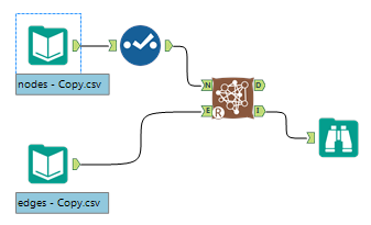
First create your tables of nodes (the dots) and edges (the lines between the dots).
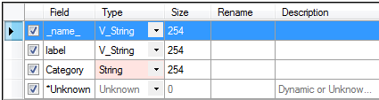
The documentation states that your nodes must have a unique identifier with the fieldname of “_name_” and the edges must have fields “from” and “to”. Actually in practice I found it often works fine even without using those specific field names, but it is to rename columns in Alteryx (use the Select tool for instance) so one might as well follow the instructions where possible.
So for a basic example, here’s our table of nodes:
| _name_ | label | Category |
|---|---|---|
| 1 | A | Cat1 |
| 2 | B | Cat1 |
| 3 | C | Cat1 |
| 4 | D | Cat2 |
| 5 | E | Cat2 |
| 6 | F | Cat2 |
| 7 | G | Cat3 |
| 8 | H | Cat3 |
| 9 | I | Cat3 |
| 10 | J | Cat3 |
And edges:
| From | To |
|---|---|
| 1 | 2 |
| 1 | 3 |
| 1 | 4 |
| 1 | 7 |
| 1 | 9 |
| 2 | 8 |
| 2 | 7 |
| 2 | 1 |
| 2 | 10 |
| 3 | 6 |
| 3 | 8 |
Pop a “Network Analysis” tool onto the canvas. It’s in the Predictive section of the Alteryx toolbar. Then hook up your nodes file to the N input and edges file to the E input.
There’s some configuration options on the Network Analysis tool I’ll mention briefly shortly, but for now, that’s it, job done! Press the run button and enjoy the results.
The D output of the tool gives you a data table, 1 row per node, showing various graph-related statistics per node: betweenness, degree, closeness, pagerank and evcent. You can then directly use these statistics later on in your workflow.
The I output gives you a interactive graphical representation of your network with cool features like ability to search for a given node, tooltips upon hover, click to drag/highlight nodes, some summary stats and a histogram of various graph statistics that describe the characteristics of your network like this:
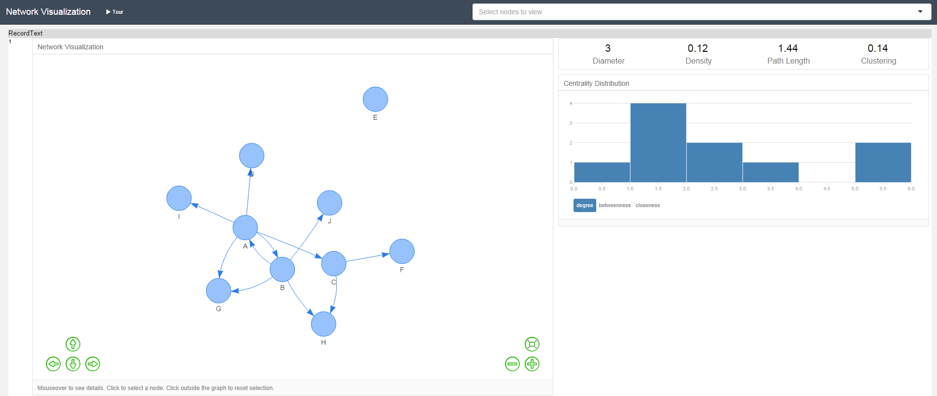
Although for most tools the “auto-browse” function of Alteryx 10 negates the need for a Browse tool, you will need one connected to the I output if you want to see the graphic representation of your network.
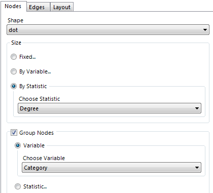
There are some useful configuration options in the Network Visualisation tool itself in 3 categories; nodes, edges and layout.
Perhaps the 3 most interesting ones are:
- ability to size nodes either based on their network statistics or another variable,
- ability to have directed (A connects to B, B might not connect to A) or undirected (A connects to B implies B connects to A) edges.
- ability to group nodes by either network statistics or another variable (e.g. to differentiate between Facebook friends and Facebook groups).
Here for example is the above diagram where the nodes are sized by degree (# connections), coloured by my variable “Category” and the edges are set to directed.
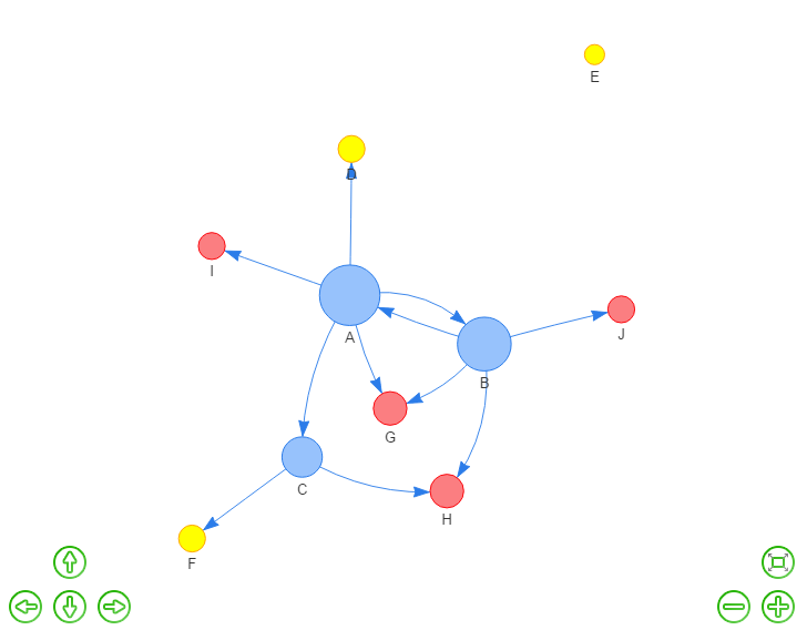
Sidenote 1: There seems to be a trick to getting the group-by-variable to work though, which I’m not sure is intentional(?). I found that the tool would only recognise my grouping variables if they were specifically of type “String”.
Alteryx text from an input file usually defaults to type “V_string” but the Network Viz tool would not let me select my “Category” field to group nodes by if I left it at that. However it’s very easy to convert from V_string to String by use of a Select tool
Sidenote 2: For people like me who are locked down to an old version of Internet Explorer (!) – the happy news is that the Alteryx network viz works even in that situation. In previous versions of Alteryx I found that the “interactive” visualisations tended to fail if one had an old version of IE installed.
Overall, the tool seems to work well, and is as quick and easy to use as users of Alteryx have probably come to expect. It even, dare I say it, has an element of fun to it.
It’s not going to rival – and probably never will try to – the flexibility of Gephi for those hand-crafting large complex networks with a need for in-depth customisation options and output. Stick with that if you need the more advanced features (or if you can’t afford to buy Alteryx!).
But for many people, I believe it contains enough features even in this first version to do the basics of what most analysts probably want a network viz for, and will save you hours in comparison vs finding and learning another package.
At least for relatively small numbers of nodes anyway; on my first try I found it hard to gain much insight from the display of a larger network as the viewing area was quite small – but some of this is innate to the nature of the visualisation type itself. I have also not yet experimented very much with the different layout options available, some of which might dramatically improve things if they have similar impact to the Gephi layout options. Picking the optimum location to display each node is a distinctly non-trivial task for software to do!
Remember also that as the “D” output gives a data table of network stats per node, one could always use that output to pre-filter another incarnation of the network viz tool and show only the most “interesting” nodes if that was more useful.
In general this new Alteryx tool is so easy to use and gives such quick results that I hope to see it promote effective use of such diagrams in real-world situations where they can be useful. At the very least, I’m sure it’ll convince a few new “data artisans” to give network analysis a try.

Very nice article !! Is there way we can show this Viz in tableau as well?
LikeLike
Hi! Thanks for the comment.
Unfortunately Tableau doesn’t seem to have direct support for this type of visualisation at the moment. But they do have an article with suggestions of workarounds where you can make something that looks similarish at https://kb.tableau.com/articles/howto/creating-a-network-graph
Hopefully one day they’ll introduce a full feature of this!
LikeLike
This is a great article! But I am getting an error with the Network Analysis tool with Alteryx version 2018.3:
1.) “Tool #4: Error in graph.data.frame(d=x,directed=directed,vertices=vertices):”
2.) “Tool #4: Execution halted”
3.) “Tool #4: The R.exe exit code (1)indicated an error.”
The format of my edge table is:
4 rows, 2 columns. Column Names: “FROM” and “TO”, column type are v_wstring
The format of my node table is:
1 rows, 1 column. Column name: “_NAME_”, column type is v_wstring
Please help!
LikeLike