The intrinsic power of the the chart is highlighted nicely in a recent Harvard Business Review post.
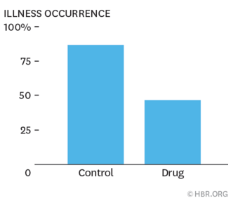
In an experiment (*), Aner Tal et al. had a couple of groups read about a new medication that supposedly reduced the incidence of illness by 40%. This was clearly stated in the text the readers were given.
The only difference between the two groups was that one of them was reading a document that had a very simple bar chart below it. The chart just showed exactly the same claim; that the incidence of illness went down 40% with this new medication.
When they tried to measure, the presence of this chart didn’t seem to increase the understanding or the information retention of the people viewing it in comparison to the other group.
However, it did make a difference to what the readers believed.
97% of those who had seen the chart believed the medication would reduce illness, vs just 68% those who had read (and understood) the exact same information, but in purely text form.
This is clearly irrational, but shows the impact dataviz can have – even when it technically delivers no new information and does not make the existing information easier to understand.
But don’t think rationality will save you! The researchers found that those people who agreed most strongly with “I believe in science” (a strange thing to ask to be fair, but I assume at least somewhat positively associated with those people who consider themselves most rational) saw the largest boost to believing in the medication post-chart. They hypothesise some sort of “I believe in science -> charts mean science -> I believe in whatever the chart says” type halo phenomena.
I then wondered what would happen if one popped an entirely irrelevant chart under the article. Would that work as well? Not even delving into the wonderful world of how to lie with charts, but simply present a chart on an entirely different subject. Perhaps one from one of the hilarious faux-science hair product adverts would be a good choice (85% neutrilliam! 5.32948% aquaspheres!).
It didn’t seem like the researchers tried that one in the above study, but there is a similiarish study from 2012. No charts involved sadly, but it looked at the impact of putting a totally irrelevant mathematical equation on a document. That they called it “The Nonsense Math Effect” gives a clue as to the results.
Here they had groups of highly educated post-grads look at abstracts of two (real) journal papers, one on anthropology and one on sociology. They then had to rate their perception of the quality of the research on a scale from 1 to 100.
Both groups read the same abstracts, except one group would see the following sentence added on to the end of the abstract.
A mathematical model (TPP = T0 − fT0d2f −fTP d2f ) is developed to describe sequential effects.
This sentence was taken from a totally different paper, which concerned reaction times. There was no relationship between this sentence and the two abstracts the readers were given. In fact:
none of the original abstracts mention any sequential effects or anything that the symbols in the equation could reasonably correspond to
Can you guess what happened?
Of course, the net effect was that the group that read the abstracts with this meaningless sentence pasted on at the end rated the quality of the research significantly higher than those that didn’t (**). The research was indeed more highly regarded if a string of contextually meaningless characters that look a bit like complicated maths was written below it.
Remember, datavizzers, with great power comes great responsibility. Be sure to never abuse your profession.

(*) It’s not listed in the article, but I believe the published article they refer to is this one, although you’ll need a subscription to the “Public Understanding of Science” journal to get to the full paper.
(**) When broken down, there was one group of readers who didn’t fall into that trap: those who were experts in maths, science and technology (and those who studied medicine were perhaps not statistically significantly different). Most of the world doesn’t hold post-graduate degrees in mathematics though.
