Happy new year to all! And now that’s over, back to work.
The first drama of 2016 was opening up some spiffy new Tableau dashboards someone made to see how business is at in the first week of the year, only to find apparently catastrophic results. Sales this week were way below sales of the same week in the previous year – unbelievably so in fact. Luckily it was so unbelievable that we checked the calculation and realised it was obviously wrong.
The purpose of the table was to compare sales in the first fiscal week of 2016 with those in the first fiscal week of 2015.
- The first fiscal week of 2016 runs from 3rd January 2016 to 9th January 2016.
- The first fiscal week of 2015 runs from th January 2015 to 10th January 2015.
- We opened the dashboard on the 4th January 2016.
Can you guess what went wrong?
The dashboard was labelled such that it appeared to be comparing all of the first fiscal week of 2016 to all of the first fiscal week of 2015, even though so far only 2 days of the 2016 week had elapsed. It was therefore actually comparing 2 days worth of data this year to 7 days last year – and unless your business has some serious growth, that’s never going to produce a positive result!
What should have been happening, to generate a more useful result, is that the dashboard should have checked how many days had actually elapsed in the week selected for analysis, and then compared it to only the same number of days in the corresponding week of prior year. As only two days of 2016 week had elapsed, it should have compared it to just the first two days of the 2015 week.
To slightly add to the complexity: interactivity is always a crowd-pleaser, so the user is supposed to be able to select any given week, past or present, to compare data from with a Tableau parameter.
If they select a week where we do have 7 days worth of data, e.g. week 52 2015, then it should compare that to the whole 7 days worth of data from week 52 2014. Thus, the dashboard must adapt on the fly based on what data is available at run time, not design time.
As ever, there’s more than one way to have Tableau do this. Below is a quick method one can use which seems to do the trick, relying on my favourite feature of Tableau 9, the “Level Of Detail” calculations.
This method can be realised via approximately 2 calculated fields, but for the sake of clarity I’ll split it into a few more here.
Firstly, here’s some data (fictional, of course). The column on the right is displaying the sales achieved on the given day.

Note how if I thoughtlessly ask it to show the sum of sales in both years for fiscal week 2, then the 2016 result is worse than the 2015 result.
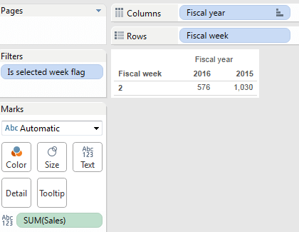
This is because it’s comparing the 2 available days for fiscal week 2 2016 with the 7 available days for fiscal week 2 2015; very misleading.
My first step to prevent this happening was to have Tableau establish what weekdays are actually available in the fiscal year/week the user selects. In the dashboard UI, the user selects this week via use of 2 parameters: “Choose year” and “Choose week”.
1: find out which weekdays in the week the user selected actually have data available
Create a formula called “Weekday in selected week”, like this:
IF [Fiscal week] = [Choose week] AND [Fiscal year] = [Choose year] THEN

DATEPART('weekday',[Date])

END
DATEPART returns the part of the date (duh) specified by its first parameter – here the “weekday”, which Tableau encodes such that Sunday = 1, Monday = 2 etc. through to Saturday = 7.
This formula therefore returns the weekday number for every record that is in the year and week the user has selected in the parameters, but – importantly – returns nothing if the record corresponds to a date in any other year/week.
2: Determine the most recent weekday that has data in the week the user selected
The next formula aggregates that function to find the maximum day of week, using the a basic level of detail expression.
Last weekday in selected week:
{ FIXED : MAX([Weekday in selected week])}
This looks for the maximum “Weekday in selected week” over the whole dataset, no matter which filters might be being applied in the view (*).
Given that “Weekday in selected week” field only ever contains information for the week the user has selected, this is equivalent to saying “what is the most recent weekday available in the week the user selected?”.
If the complete week is available, all 7 days of it, then it will return “7” which is equivalent to Saturday. If only two days are present, Sunday and Monday, then it will return “2”, meaning only up to Monday is there.
Whatever it finds, this value will be replicated down the table for every record, due to the “FIXED” level of detail.
(*) actually the special context or datasource filters would affect the results, but we’ll leave that for another time, except to note that so many of the top Tableau Jedi tricks I’ve seen in recent time make use of this fact!
3: Classify each record as to whether it forms part of the selected week, the relevant part of the same fiscal week a year ago or is not at all relevant.
Now we know which week the user selected, and the maximum weekday in that week, we can easily classify every record as to whether it’s in the selected week, or in the relevant part of the same fiscal week a year ago.
Week selection status:
IF [Fiscal year] = [Choose year] AND [Fiscal week] = [Choose week]

THEN 'Selected week'
ELSEIF [Fiscal year] = ([Choose year] -1) AND [Fiscal week] = [Choose week]
AND DATEPART('weekday', [Date]) <= [Last weekday in selected week]
THEN 'Prior year'
ELSE 'Not relevant to analysis'
END
So what?
After this, like-for-like comparisons become easy; you can just use the “week selection status” as a dimension in your analysis, or create measures based on it such as:
Current year sales:
IF [Week selection status]= 'Selected week' THEN [Sales]

ELSE 0

END
Prior year sales:
IF [Week selection status]= 'Prior year' THEN [Sales]

ELSE 0

END
Making a quick dashboard using those measures allows you to see that the sales results are now being compared correctly.

See how in the bottom table above indeed the current year sales are higher than the prior year sales for the same week once we take into account the fact that only 2 days of sales are available so far this year – in comparison to the top (misleading) table, which was the one that was comparing the 2 days of sales this year to the 7 days of sales in the same fiscal week last year.
How does it work?
Level of expression details are a relatively new Tableau feature and may be confusing if you are not used to tools that allow using data “outside of the current row”. If confused, I often find it helpful to make Tableau produce a text table at the most granular level and have it show the results of these sorts of expressions on every row.
Here’s what it would look like to do that for the above set of formulae, given the example data, when the user has selected to see fiscal week 2 in year 2016.

Note how:
- Fiscal year, week, day of date are all in the original data supplied.
- “Weekday in selected week” is null for every row except those that are in the year/week that the user specified in the parameters.
- “Last weekday in selected week” is the same for every row, and shows the highest number from the previous column “weekday in selected week”.
- “Week selection status” shows “not relevant” except where either a) the record has a week / year combination that matches the values the user specified in the parameter, or b) it is of the same fiscal week in the prior year and has a weekday that is no greater than the maximum weekday available in the current year’s version.
You can download the example workbook, including all of the above, here if you wish.
Sidenote: looks like I wasn’t the only person risking shock via the incomplete weeks issue! Vizpainter recently published a nice post on a similar topic; concentrating more on decent ways to visualise partial time series data, rather than calculating comparisons. Recommended.
