Never one to rush into things :-), here’s the second part of my journey towards creating a Tableau Web Data Connector.
Next on my plan was to try out an existing Web Data Connector so I could see what they looked like in practice. It’s always useful to review examples of other people’s work in analytical tools, if nothing else to get some insight into the potential scope and usefulness of their features.
Googling around made it clear that there are many generous people who have released free-to-use Tableau web data connectors for a bunch of services. I decided to go with the “Moves” web data connector, created and hosted by the Tableau experts at the Information Lab here.
For the uninitiated, Moves is an app for iOS and Android smartphones that sits in the background and records where you’ve been, and how active you’ve been whilst going there.
Moves is an automatic diary of your life. Your daily storyline and maps show where, when, and how much you move.
On one’s phone, it produces a daily timeline of activity like the below. Most days I work from home, and it really, really would not be a very interesting experience to visualise the locations I visit! So to make this more interesting, I’ve picked a day where I happened to be in Spain and needed to get back to my home in the UK. Here’s what the app shows me:
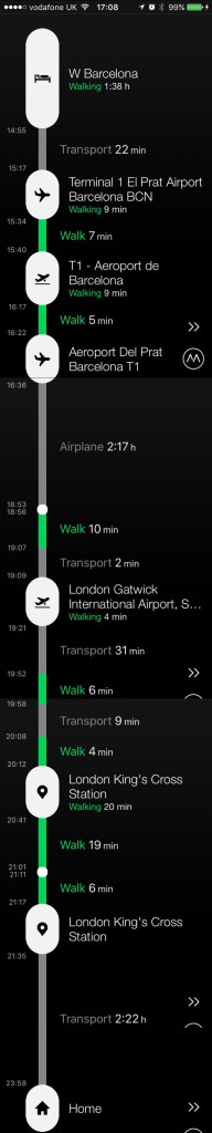
It’s not perfect, but you can clearly see my journey from the hotel to Barcelona airport, then to London, and onto the train network to get me home. Considering I have not spent much time customising and correcting it, it’s not bad at all. It could certainly be useful if, for instance, I wanted to know how many times per year I went to Kings Cross.
But the app itself won’t tell me that very easily.
You can export your data from their website though. If you do that, you’ll get a zip file with actually a very comprehensive set of data files, including a representation of your data in JSON, CSV, KML, GPX and even a ICS calendar file of locations. Within those categories are hundreds of files, representing different time granularities, dimensions, summaries and so on. It’s actually very comprehensive, full marks to ’em – but who wants the faff of downloading that every time you want a visualisation, working out which is the correct file, and creating something suitable for import into your favourite dataviz product? Not us, surely!
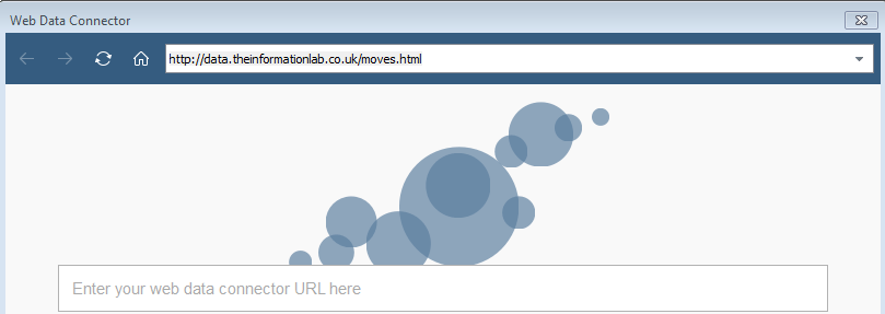
So instead I opened up a recent version of Tableau, and chose to connect to a web data connector. I then entered the web address of the web data connector that the Information Lab provided, which is http://data.theinformationlab.co.uk/moves.html.
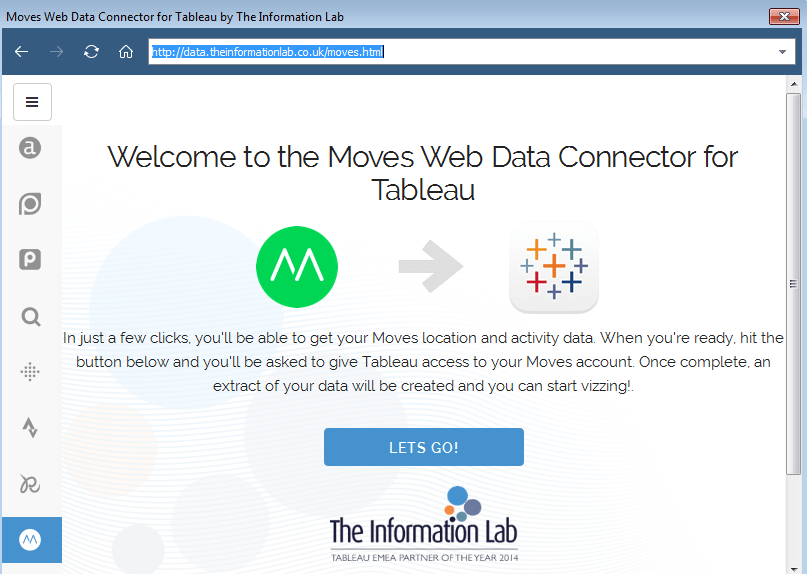
This led me to a screen evidently designed by the Information Lab team, with a nice “Let’s Go” button. So I did.
 The next screen gave me a security code and told me to go into the Moves app on my phone to enter it, so that it knew I was happy for the data connector to see my data. I could tell from the address in the mini web-browser that this page was an authorisation page coming from the Moves app website.
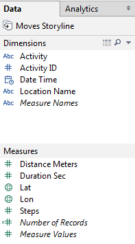
Once I had done that, I was returned to Tableau where I waited for a couple of seconds and then was given the normal Tableau user interface screen, with a dataset called “Moves Storyline” already magically loaded up for me.
From that point on, I could use Tableau just like with any other Tableau dataset.
Fortunately the field names were self-explanatory enough to make sense of. They were also categorised into dimensions and measures, and by data type, in a useful way – although whether that’s a property of the web data connector or Tableau’s auto-recognition feature wasn’t immediately clear.
Anyway, time to visualise my trip home from Spain!
Here’s a few example records.
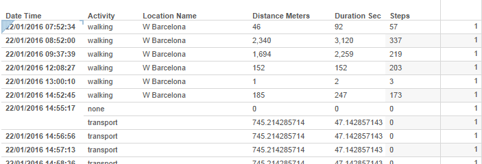
It looks like it’s recording datapoints every so often, recording where I was, how I was moving and for how far/long etc. This is also how it works in the manual data export from the Moves website.
Apparently I was walking around the hotel a lot that morning. Although I’m not so sure I could really have covered 2km in 337 steps! That said, I’ve never found iPhone step counters all that accurate, so was not too surprised to find a similar issue here.
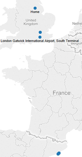
The dataset also provides a latitude (“Lat”) and longitude (“Lon”) too, which means you can quickly construct geographic maps of your day in Tableau too. Here’s a few salient geo-points of my day, on a Tableau map.
So, what have I learnt?
- Analysing ones’ movements when you largely work from home in a rural location is not all that thrilling on most days! But that aside:
- Tableau web data connectors are hosted on, and “look like” web pages. The Tableau connection interface seems like it’s really a mini web-browser. This implies one needs to be able to host web pages somewhere to make your own. Luckily I have some past experience with regard to making websites, so this hopefully won’t be a problem.
- The data returned by a web data connector comes in the form of a static Tableau extract. It doesn’t updated automatically. If I open the file I used above next week then it will still only have data in up until today. However, you can “Extract -> Refresh” in Tableau and then it will automatically suck in the new data, without having to go through the data connection process again, basically the same as how a “normal” database extract/refresh works. It therefore must be storing the connection details and credentials.
- The connection process interacted with my app on the phone, over which neither Tableau or the Information Lab would have had control. It used the authentication features provided by the Moves website itself. This makes a lot of sense; personal location data can be extremely sensitive, so Tableau must have provided or allowed a facility to the auth features of external sites. However, I already decided to start my own creating process with a website that doesn’t require any authentication, so this probably isn’t something that is important to me right now – but it’s good to know there are ways to use confidential data in a secure way.
So now I know what a web data connector looks like to the end user and the format of data it can produce. Time to learn how to make one!
