Next month, the UK is having a referendum on the question of whether it should remain in the European Union, or leave it. All us citizens are having the opportunity to pop down to the ballot box to register our views. And in the mean time we’re subjected to a fairly horrendous mishmash of “facts” and arguments as to why we should stay or go.
To get the obvious question out of the way, allow me to volunteer that I believe remaining in the EU is the better option, both conceptually and practically. So go tick the right box please! But I can certainly understand the level of confusion amongst the undecided when, to pick one example, one side says things like “The EU is a threat to the NHS” (and produces a much ridiculed video to “illustrate” it) and the other says “Only staying in Europe will protect our NHS”.
So, what’s the result to be? Well, as with any such election, the result depends on both which side each eligible citizen actually would vote for, and the likelihood of that person actually bothering to turn out and vote.
Although overall polling is quite close at the moment, different sub-groups of the population have been identified that are more positive or more negative towards the prospect of remaining in the EU. Furthermore, these groups range in likelihood with regards to saying they will go out and vote (which it must be said is a radically different proposition to actually going out and voting – talk is cheap – but one has to start somewhere).
Yougov recently published some figures they collected that allow one to connect certain subgroups in terms of the % of them that are in favour of remaining (or leaving, if you prefer to think of it that way around) with the rank order of how likely they are to say they’ll actually go and vote. Below, I’ve taken the liberty of incorporating that data into a dashboard that allows exploration of the populations for which they segmented for, their relative likelihood to vote “remain” (invert it if you prefer “leave”), and how likely they are to turn out and vote.
Click here or on the picture below to go and play. And see below for some obvious takeaways.

So, a few thoughts:
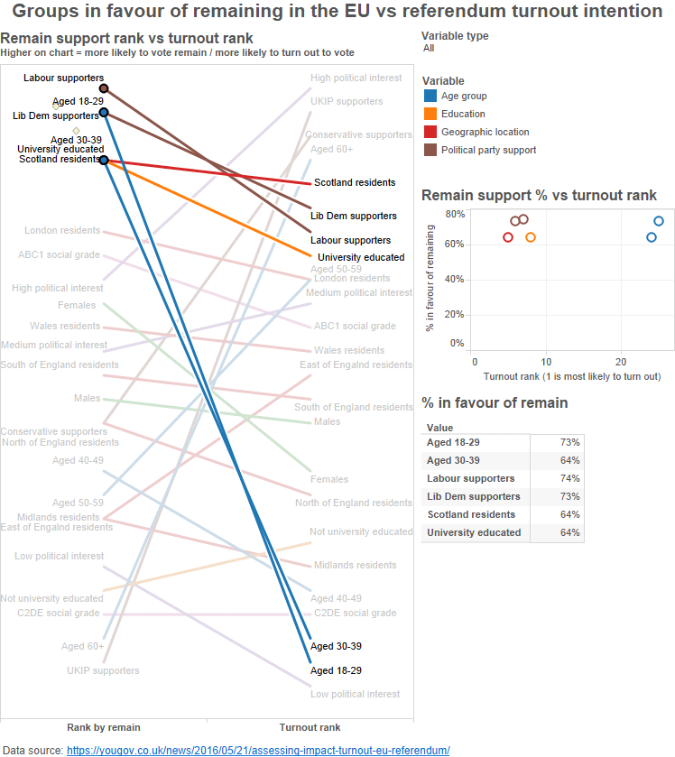
First we should note that the ranks on the slope chart perhaps over-emphasise differences. The scatterplot helps integrate the idea of what the actual percentage of each population that might vote to remain in Europe is, as opposed to the simple ranking. Although there is substantial variation, there’s no mind-blowing trend in terms of the % who would vote remain and the turnout rank (1 = most likely to claim they will turn out to vote).
![]()
I’ve highlighted the extremes on the chart above. Those most in favour to remain are Labour supporters; those least in favour are UKIP supporters. Although we might note that there’s apparently 3% of UKIP fans who would vote to remain. This is possibly a 3% that should get around to changing party affiliation, given that UKIP was largely set up to campaign to get the UK out of Europe, and its current manifesto rants against “a political establishment that wants to keep us enslaved in the Euro project”.
Those claiming to be most likely to vote are those who say they have a high interest in politics, those least likely are those that say they have a low interest. This makes perfect sense – although it should be noted that one’s personal interest in politics of course does not entirely affect the impact of other people’s political decisions that will then be imposed upon you.
So what? Well, in a conference I went to recently, I was told that a certain US object d’ridicule Donald Trump has made effective use of data in his campaign (or at least his staff did). To paraphrase, they apparently realised rather quickly that no amount of data science would result in the ability to make people who do not already like Donald Trump’s senseless, dangerous, awful policies become fans of him (can you guess my feelings?). That would take more magic than even data could bring.
But they realised that they could target quite precisely where the sort of people who do already tend to like him live, and hence harangue them to get out and vote. And whether that is the reason that this malevolent joker is still in the running or not I wouldn’t like to say – but it looks like it didn’t hurt.
So, righteous Remainers, let’s do likewise. Let’s look for some populations that are already the very favourable to remaining in the EU, and see whether they’re likely to turn out unaided.
Well, unfortunately all of the top “in favour to remain” groups seem to be ranked lower in terms of turnout than in terms of pro-remain feeling, but one variable sticks out like a sore thumb: age. It appears that people at the lower end of the age groups, here 18-39, are both some of the most likely subsections of people to be pro-Remain, and some of the least likely to say they’ll go and vote. So, citizens, it is your duty to go out and accost some youngsters; drag’em to the polling booth if necessary. It’s also of interest to note that if leaving the EU is a “bad thing”, then, long term, it’s the younger members of society who are likely to suffer the most (assuming it’s not over-turned any time soon).
But who do we need to nobble educate? Let’s look at the subsections of population that are most eager to leave the EU:
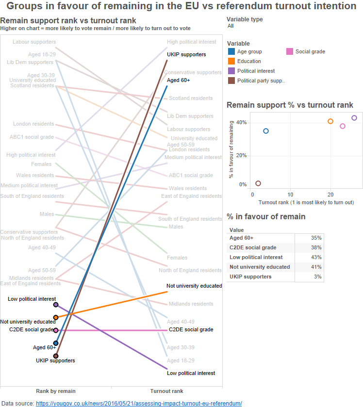
OK, some of the pro-leavers also rank quite low in terms of turnout, all good. But a couple of lines rather stand out.
One is age based again; here the opposite end of the spectrum, 60+ year-olds, are some of the least likely to want to remain in Europe and some of the most likely to say they’ll go and vote (historically, the latter has indeed been true). And, well, UKIP people don’t like Europe pretty much by definition – but they seem worryingly likely to claim they’re going to turn up and vote. Time to go on a quick affiliation conversion mission – or at least plan a big purple-and-yellow distraction of some kind…?
There’s at least one obvious critical measure missing from this analysis, and that is the respective sizes of the subpopulations. The population of UKIP supporters for instance is very likely, even now, to be smaller than the number of 60+ year olds, thankfully – a fact that you’d have to take into account when deciding how to have the biggest impact.
Whilst the Yougov data published did not include these volumes, they did build a fun interactive “referendum simulator” that, presumably taking this into account, lets you simulate the likely results based on your view of the likely turnout, age & class skew based on their latest polling numbers.

One thought on “The EU referendum: voting intention vs voting turnout”