A question came up recently about variations in the age at menarche – the first occurrence of menstruation for a female human – with regards to the environment. A comparison by country seemed like a reasonable first step in noting whether there were in fact any significant, potentially environmental, differences in this age.
A quick Google search seemed to suggest a nice reliable chart summarising this data by country was surprisingly (?) hard to find. However, delving more into academic publishing world, I did find a relevant paper called “International variability of ages at menarche and menopause: patterns and main determinants” (Thomas et al, in Hum Biol. 2001 Apr;73(2):271-90), which stated that the purpose of their study was:
to review published studies on the variability of age at menarche and age at menopause throughout the world, and to identify the main causes for age variation in the timing of these events.
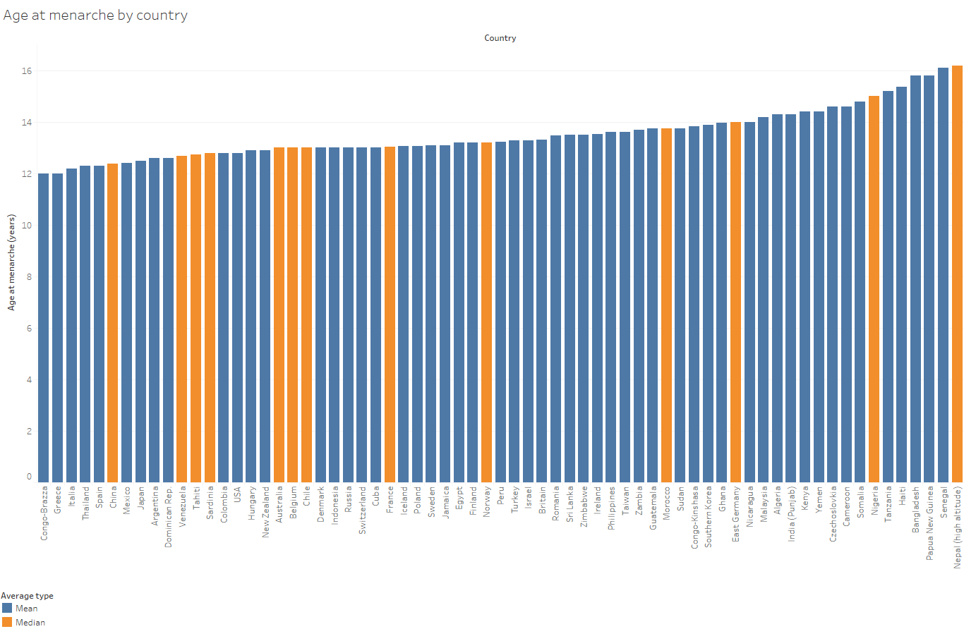
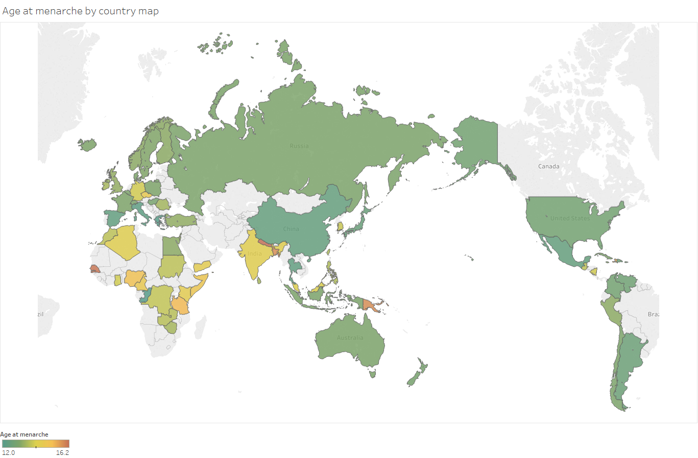
Score! And sure enough, it does contain a lengthyish datatable showing the average age of menarche by country from a survey of prior literature that they did. However, it’s not super easy to get a immediately get a sense of the magnitude of any variation by looking at a datatable from a scanned PDF that was printed over 3 pages. Instead, I decided to extract the data from that table and visualise it in a couple of charts which are shown below, in case anyone else has a similar curiosity about the subject.
Firstly a simple bar chart. You may wish to click through to get a larger copy with more readable axes:
And now plotted geographically:
There’s also an interactive dashboard version available if you click here, where you can filter, highlight, hover and otherwise interact with the data.
If you have a use for the underlying data yourself, I uploaded it in a machine-readable format to data.world, whereby you can connect directly to it from various analytics tools, use the querying or visualisation tools on the site itself, or download it for your own use. Again, this data is all consolidated by the authors of the Human Biology study above, so full credit is due to them.
A couple of notes to be aware of:
Firstly, the study I took the data from was published in 2001 i.e. is not particularly recent. The menarche age averages shown were collected from other studies, which obviously took place before 2001 – some even decades before, and in countries that technically no longer exist! They therefore may not reflect current values.
It’s generally considered that menarche ages have changed over time to some extent – for example a study concerning self-reported age of menarche in the US “Has age at menarche changed? Results from the National Health and Nutrition Examination Survey (NHANES) 1999-2004.” (McDowell et al, J Adolesc Health. 2007 Mar;40(3):227-31) concluded that “Mean age of menarche declined by .9 year overall in women born before 1920 compared to women born in 1980-84” (and also that ages and changes differed by ethnicity, showing that country averages may mask underlying structural differences). A few other such studies I skimmed, usually focusing on individual countries, also tended to show trends in the same direction. One might hypothesize that countries where the general population has been through even more radical living-condition shifts than residents of the US over the past few decades may have seen larger changes than those reported by McDowell et al.
Secondly, some of the averages reported are means, others are medians. These may not be directly comparable. The bar chart I’ve shown above differentiates between those based on the colour of the bar. In the interactive version there’s the ability to filter to only show results based on a single one of those aggregation types.
So now onto the interesting theoretical part – OK, menarche age may differ between countries, but why? As noted, that was part of the question driving the authors of the source study, so you should certainly read their whole study to get their take. In summary though, they created a sequence of linear models.
The first one shows a negative association between life expectancy and menarche age. OK, but what factors drive life expectancy in the first place, that also correlate with menarche?
They produced 2 alternative models to investigate that. The first was a combination of illiteracy rate (with a positive correlation) and vegetable calorie consumption (negative). The second kept illiteracy in, but switched in the country’s average gross national product for vegetable calorie consumption.
Vegetable calorie consumption is perhaps somewhat intuitive – it’s been previously found that what their paper describes as “good nutritional conditions” tend to lower the age of menarche, with the body’s fat:mass ratio being potentially involved. There are many papers on that topic – not being remotely a subject matter expert here I’ll pick one at random – “Body weight and the initiation of puberty” (Baker, Clin Obstet Gynecol. 1985 Sep;28(3):573-9.), which concluded that malnutrition may “retard the onset of menarche”.
But the larger influence in the model was the country’s illiteracy rate. Does reading books induce menstruation? Well, hey, probably not directly, so it likely proxies for something that may more plausibly affect menarche. The theory the researchers present here is that societies with higher illiteracy also tend to have a higher incidence of child labour. This labour is often physical in nature, implying a higher rate of energy expenditure. Citing previous evidence that excessive exercise may affect the fat balance, again altering menarche, they form a new hypothesis that it’s in fact the energy balance within a person that may affect menarche.

So like- let’s not do canada?
LikeLike
correlations – calorie intake – stimulation to lactate
LikeLike