It may be more than two and a half years into the pandemic, but the battle of “what is true?”” regarding many aspects of the Covid-19 pandemic continues.
Many of us have probably seen a chart like this floating around social media in recent times.

The implication – or more often the explicit claim – is that we should be worried about the vaccine. Is it actually increasing our chance of dying from Covid, or at least not helping? It doesn’t look great, right?
Naturally, looking into where this all came from and what it means led me down a data wormhole, which will come in rambling format below. But for people with less patience than that will take, let’s start with the conclusions I reached on the subject.
Standard disclaimers apply: I’m no epidemiologist, I didn’t collect the data, and so on – ask a real expert before making health decisions. And I’m always grateful to receive corrections if I have misunderstood something.
Summary
The chart does represent data from a reputable source correctly. But if you’re trying to get a sense of your own risk, for example to decide whether the vaccine is for you, then the metric “vaccinated as % of deaths” is useless for uncontrolled observational data such as this.
A scenario in which it may truly have been informative is if a random 50% of the country were vaccinated simultaneously and the rest never were. That is not what happened!
For populations of different sizes and constitutions – the vaccinated vs the unvaccinated – the metric of interest would be a “rate within each group” based measure, ideally controlled for the pre-existing risk factors people have. A perfectly standard version of that kind of metric appears in same data table that the chart seems to have been built from – but the chart author chose to ignore it. That data point suggests that people who are vaccinated are much less likely to die from Covid than those who aren’t.
There are several reasons why we should expect to see a higher count of deaths come from the vaccinated population right now, even if the vaccine is effective – as long as it’s not 100% effective.
The biggest one is that in comparing vaccinated to unvaccinated people at the present time, we’re actually comparing death counts between:
- The vaccinated: a huge group of people who on average have a high natural risk of dying of Covid.
- The unvaccinated: a small group of people who on average have a low natural risk of dying of Covid, plus a lot of pre-existing natural immunity.
Given no-one serious claims the vaccine is perfect, it’s not surprising that most of the deaths come from the former group.
There’s no discernable “establishment cover-up” of this information. The information that a high percentage of Covid deaths are from vaccinated people has been easily findable on the Office of National Statistics website since at least September 2021, and further publicised in headlines from many national newspapers and mainstream websites for over a year. The reason many other articles don’t talk about it is probably because it’s not an informative measure for the sort of questions readers are usually interested in.
In more depth
- The actual numbers the chart shows accurately reflect the data, which is from a reliable source.
- But the “vaccines are dangerous” takeaway that usually accompanies the chart, whilst intuitive, is wrong. The Covid-19 vaccine is safe for the vast, vast majority of people. Figures from the same dataset that the chart data comes from suggests the vaccine continues to save lives – as does basically every major published and peer-reviewed study on the subject.
- The chart cherry-picks only the data from the 2 most recent months from a dataset which contains data back to 2021. If you look at the time period where few people were vaccinated you see the opposite pattern.
- There are genuine reasons why you may now be less protected with your original Covid vaccine than you were in the past, particularly if you haven’t had a booster. But protection specifically against death still appears to be high.
- The protection from vaccines wanes over time. The longer ago you had your vaccine the less protected you are, particularly from catching Covid. However the protection against death appears to remain high for much longer.
- The vaccines are less effective against the newer variants of Covid, at least in terms of catching the disease. However, they are still effective, above the minimum threshold that the FDA originally set for them being licensed. More relevant here, whilst there’s obviously less data on newer variants, what exists so far suggests that the the protection specifically against death remains very high, even for Omicron.
- There are also structural reasons why a comparison of vaccinated vs unvaccinated people in recent months will almost inevitably show more deaths in the vaccinated group.
- Almost everyone in England has been vaccinated! With an uptake rate of over 90%, if the vaccine halved your risk of death then you would still see far more vaccinated deaths than unvaccinated. A small proportion of a giant number can be bigger than a large proportion of a tiny number.
- Originally the unvaccinated group had no protection against Covid. However now it’s thought that at least 70%, and likely more like 90%, of the British have had Covid. Those that survive the disease are left with some immunity. So we’re often comparing “people who may be immune because of a vaccine” against “people who may be immune because they caught Covid”.
- Unfortunately some people die of Covid. The pandemic has raged on for over two years now. Many of most vulnerable people have already been killed. If you accept that you are more likely to have caught and had a worse experience of Covid if you were unvaccinated, that implies that the unvaccinated group left today will have a further bias towards those who are less vulnerable to death.
- The people in the vaccinated group are different to the people in the unvaccinated group. At first this was by design. The UK only allowed the most vulnerable people to access the vaccine at first – primarily those of an older age or with a medical condition that made them vulnerable to serious harm from Covid. Although now at least three doses are available to anyone, it’s still the case that proportionally more older people have taken the vaccine than younger (and I’d imagine the same for other vulnerable conditions, although I can’t find actual numbers.). Age is hugely important when it comes to Covid mortality. Estimates suggest that the risk of death halves if you’re just 6-7 years younger.
- Once you control just for 1) the different number of people in the vaccinated vs unvaccinated group and 2) the difference in ages of those people, it appears that, despite all the above, the chances of dying of Covid if you’re vaccinated are still much lower than if you’re not. That is true despite any waning, new variant or having a vulnerable condition effect, all of which would tend to make the vaccine look less effective than it is.
- This is not a conspiracy of hidden data!
- An earlier version of the data file the chart is based on that would have showed a similar relationship has been available and easily discoverable on the Office of National statistics website since September 2021 .
- Extremely popular sources including national news sites have had articles with headlines pointing out relatively high or majority Covid-death counts in the vaccinated for more than a year.
- To say nothing of the large number of YouTube channel, Facebook pages and Substack newsletters that specialise in having “contrarian” opinions about the Covid vaccine and other topics. Apologies for the stereotyping here – there is plenty of good work published via those sites – but such entities do exist, and the scene seems to make big money for the authors , “influencers” and the companies that host them.
- That said, the vast majority of people who look at the chart we’re talking about and feel concern are not rabid anti-vaxxers! They’re you and me. I would be surprised if an average person saw those numbers and didn’t feel some kind of concern at first glance.
And now the full rambling detail
To be honest, I’ve not taken the time to figure out exactly who the original author of the chart in question was, but after just a little link-following I got to this page from “The Expose” website which seems one of the earlier web versions, so I’m going to base the below on that.
In any case, social media posts or articles that accompany the chart tend to be along the lines of “this is evidence that the Covid-19 vaccine doesn’t work” or, more worryingly yet, “this is evidence that the Covid-19 vaccine is harmful”.
Should we be worried? The idea that almost all recent Covid-19 deaths are from people who have been vaccinated is certainly a claim that feels intuitively scary, and inconsistent with the idea that the Covid-19 vaccinations are “95% effective”, and the other such reassuring statistics that are commonly cited.
But of course the internet is full of misinformation on all sides. So for any data that one might use to make important decisions with, it’s worth spending a bit of time figuring out both veracity of the information and the interpretation.
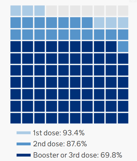
Whilst the UK has had fairly high uptake of at least the first couple of doses of the Covid-19 vaccines, plenty of people haven’t taken their boosters yet.
At the time of writing the uptake rate looks like:
With a potential 4th wave of vaccinations soon to be available for some people there are still decisions people need to make. So to the extent that that data like this may influence people’s vaccine uptake decisions, it’s worth understanding what we’re looking at.
I’d classify the truth claims of the article into two main parts.
- There’s the narrative story it’s telling; of a deliberate conspiracy to hide the data around deaths from Covid from the vaccinated.
- And then there’s the data itself, that appears to show that 94% of the Covid-19 deaths in England between April and May 2022 were from the vaccinated population.
Focussing here on the statistical claim itself, the circulated chart does give at least a rough reference as to where the data originates from, so credit goes to the author for doing that.
It refers to the Office for National Statistics. This is a national organisation who is charged with producing “official statistics” for the government and others to use to make decisions with. They’re the organisation responsible for collecting census data for instance. They are thus highly regulated and, in my admittedly limited experience of dealing with their data, above average in terms of transparency about what they collected and any statistical methods used.
Overall, the ONS is a source I think most people would consider “reliable”. Certainly the government does. So if the chart accurately reflects the ONS output, then we can have some faith in the quality of the data and any accompanying definitions.
Further down in the accompanying article there’s a link to the specific dataset in question. Perfect. It’s this Excel file, table 1.
If you feel wary about downloading random Microsoft Office files linked to from blogs then, well, that’s a great computer security intuition to have! But to reassure you, it’s also linked to from the ONS’ “Deaths by vaccination status” page . At the time of writing it’s the top link, entitled “Deaths occurring between 1 January 2021 and 31 May 2022 edition of this dataset”. That page was last updated on 6th July 2022.
So I downloaded the data and got it into R to see how well it lined up with the original chart.
First of all we need to figure out which data to select:
- Table one contains the total deaths, divided up as to whether they’re ‘Deaths involving Covid-19’ or those that don’t involve Covid. More on what this means later. In any case the chart refers to Covid-19 deaths by vaccination status, so presumably it’s the “involving” ones we want.
- It also mentioned the time frames April – May 2022. The data provides a figure for every month since January 2021, so we need to filter everything out except the latest two months.
- It contains various representations of the deceased’s vaccination status too. There’s some breakdowns as to how many vaccine doses the person had and how long ago. But to recreate this chart I think we’d just be wanting the “Ever vaccinated” and “Unvaccinated” breakdown.
Per the Definitions tab of the workbook, “Ever vaccinated” as defined as:
…anyone who has had at least 1 dose of the vaccine, regardless of further doses.
Doing that, and then summing the total deaths by vaccination status, and finally expressing them as a % of all Covid-involving deaths does indeed give you a split of 94% of deaths coming from people that have ever been vaccinated, and 6% from those that haven’t.
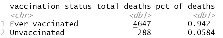
So the original chart does accurately reflect the data.
The source file actually includes per-month data since the start of 2021, so I was curious to see if the above figure had changed over time.
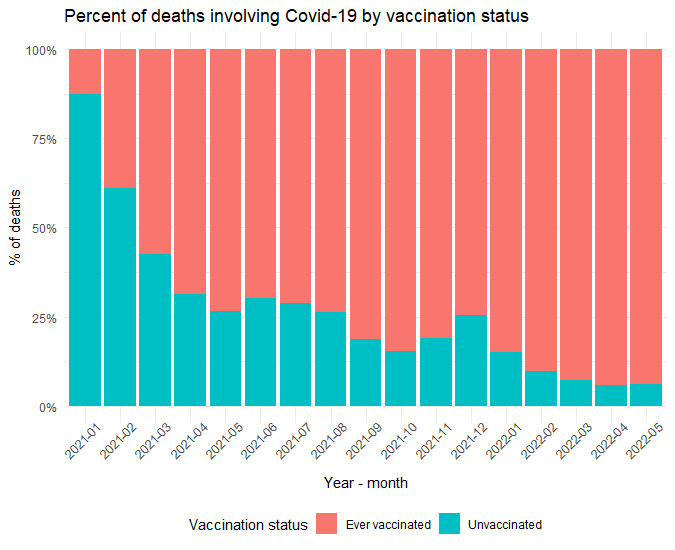
It certainly has! In January 2021 only 13% of Covid-19 involved deaths were in the vaccinated population, whereas now it’s nearer 94%.
Nonetheless, the numbers the chart showed seem legit. Right now more deaths involving Covid involve vaccinated people than unvaccinated people.
So what’s going on here?
I think there at least a couple of important dynamics to consider.
- Firstly, the properties of vaccines themselves – how protective are they? For how long? Against what exactly?
- Secondly, the nature of who is vaccinated vs not vaccinated. How many people got the vaccine? When? Are some types of people more likely to get the vaccine that other?
Starting with the former:
There’s been no recent changes in the vaccines the UK is using.
Just for reference, there’s been no changes to which vaccines are available in the UK in recent months. Here the National Health Service summons you when you become eligible to receive a vaccine, and the vast majority of people receive whichever vaccine the relevant vaccination centre is using that day. Currently the Moderna, Pfizer and AstraZeneca vaccines are approved and in use.
The Janssen, Novavax and Valneva vaccines have passed NHS approval, but are not currently used in the UK.
Immunity from Covid-19 wanes over time – but protection against death remains higher for longer.
Several studies and news reports I’ve seen show that the protection from Covid-19 vaccines wanes over time. That was to be expected, it being the case for several other vaccines – boosters are recommended for tetanus, diphtheria and polio vaccines for instance, and part of the reason the flu shot is given annually is for the same reason. Waning immunity seems to be a property of coronaviruses, meaning any natural immunity one has after catching Covid will also wane over time.
When the vaccines were first created we didn’t know how long the protection would last, but now, there’s been enough time passed that several studies have been published examining that question.
One such paper looked at what the protection over time in terms of experiencing symptomatic disease was after a double dose of either the Pfizer (referred to as BNT162b2) or AstraZeneca (ChAdOx1-S) vaccine. In terms of catching Covid they found a clear dropoff over time.
For example, against the Delta variant – which to be fair was not around when these vaccines were originally developed – vaccine efficacy peaked 2-9 weeks after inoculation at around 90% for Pfizer and 68% for AstraZeneca. However after 20 weeks that fell to around 66% and 44% respectively.
Figure 1 from the paper illustrates that.

However the outcome the chart we started this article with referred to was deaths, not simply catching the disease. For deaths, the waning effect appears to exist. But the good news is that it looks far less severe.

The Pfizer protection against deaths falls from 99% between weeks 2-9 down to 92% after week 20, with AstraZeneca falling from 95% down to 85%. Notable decreases for sure, but it’s reassuring to know that the protection against the most severe outcome of Covid is both a lot higher and longer lasting than the more widely known figures around catching the disease.
For what it’s worth, people in the UK have now had the opportunity to have a 3rd dose, the booster shot, so most will have protection superior to the 2-dose regime the above charts were based on.
The NHS made the vaccine available to the people most vulnerable to dying from Covid-19 first for obvious and important reasons. However, that means they may have started the process a relatively long time ago in comparison to less vulnerable folk. This introduces the possibility that on average they may be “more waned”, i.e. less protected, now than the less vulnerable people who started their vaccination schedule more recently.
To combat this, in Spring 2022 the NHS made an extra booster available to the most vulnerable people – those aged 75+, living in care homes or with a weakened immune system.
The official UK Coronavirus vaccination dashboard doesn’t yet report how many of those have been taken up. But it does show that the uptake of the available-to-all 3rd dose booster in the entire population is significantly lower than the first two doses of the vaccine. Many eligible people thus don’t yet have the full protection they are entitled to.
Whilst vaccines remain effective against all known variants, the level of protection against catching Covid is substantially lower for more recent ones. But protection against death likely remains high.
There have also been new variants running amok since the original development of the vaccine. Various studies have thankfully shown that the vaccines retain a considerable amount of protection against all variants so far. But the level of protection against catching Covid is significantly lower in some of the variants that emerged since they were designed.
The consensus as I understand it, in terms of catching Covid, is that the vaccines show best protection against the original virus, somewhat diminished protection against the Delta variant and notably inferior protection against Omicron. The difference between the latter two is very visible in charts like the below, which is figure 1 from a study that was looking at vaccine efficacy against the Omicron variant.

This isn’t surprising – the original vaccines were designed to combat the original virus! New vaccines are being developed that target the later variants which, if successful and released, should improve the protection against the newer threats. There’s some earlier-stage research on new delivery methods too, including nasal vaccines.
But for now, one reassuring fact, relevant to us considering we’re focussing on death due to Covid, is that it seems likely that the existing vaccines remain highly effective against deaths from Covid even for the newer variants. It’s relatively early days yet, and few studies I saw directly compare protection against death by variant. But those that use data from time periods since the Omicron strains became dominant seem positive.
One study found that the protection against death for 3 mRNA doses during a time period where Omicron dominated was 94%.
Another wasn’t about deaths as such, but found protection against hospitalisation was 91% in the Omicron period.
Page 11 of the UKHSA’s latest surveillance report summarises what is known as being that all 3 of the vaccines the UK is using offer >90% protection against death for Alpha and Delta variants, with relatively low waning.
The effectiveness against mortality rate against Omicron has been studied in people that are at least 50 years old. It was found to be 50% effective after 2 doses. It rose to 94% efficacy after 3 doses, dropping to 88% for those that had their final vaccine at least 10 weeks ago. These are considered potentially low estimates if anything as they include “with Covid” as well as “from Covid” deaths.
Table 3a of the same document consolidates the latest consensus from the UK Vaccine Effectiveness Expert Panel on effectiveness against Omicron for specific vaccines and specific outcomes, including death.
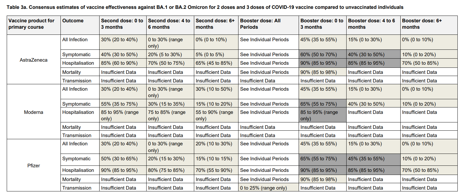
It’s clear there’s some areas we need more data for before coming to a scientifically robust conclusion. But for the cells where we do have data, the good news is that whilst the current vaccines don’t seem to offer much protection against catching Omicron in the longer term, they remain very effective against dying from it.
Now let’s move away from topics relating to properties of the vaccines themselves and onto the changes around the people who have been vaccinated.
The proportion of people who have been vaccinated has dramatically increased over time
As you would expect, as time goes on more and more people get vaccinated. Now the vast majority of the eligible UK population, 93% at the time of writing, have been vaccinated against Covid to at least some extent.
The UK had strict rules as to who was eligible for a vaccine which changed over time. This means the makeup of the vaccinated population will have changed as well. But first let’s just deal with the count of people who moved from the unvaccinated to the vaccinated group over time.
An increasing count creates the mathematically definable situation where even if the vaccine is very effective – unless it’s literally 100% effective in every circumstance – as more and more people take the vaccine then over time the percentage of people that suffer from the illness in question who were vaccinated will rise.
This might feel counterintuitive, but we can prime our intuition pumps by thinking of a simple world where there’s a population of 1000 people and mysterious disease that left to its own devices kills 10% of the population.
Let’s imagine a vaccine is developed which reduces the chance of death to a vaccinated person to a tenth of that value, 1%. Pretty impressive!
Let’s consider 5 scenarios:
- Scenario A: no-one is vaccinated, 10% of the population dies, which is 100 people. 100% of the deaths would be unvaccinated.
- Scenario B: 50% of the population is vaccinated. So 10% of the unvaccinated half dies (50 people), and 1% of the vaccinated half dies (5 people). 5.5% of the population dies. 9% of those 5.5% deaths are from vaccinated people.
- Scenario C: 90% of the population is vaccinated. 10 of the 100 unvaccinated die, and 9 of the vaccinated 90%. 1.9% of the population dies, of which nearly half are vaccinated.
- Scenario D: 95% of the population is vaccinated. 5 of the 50 unvaccinated die, and 9.5 (OK, this is theoretical, let’s assume you can have half a person!) of the vaccinated 95%. 1.5% of the population dies, of which most are vaccinated.
- Scenario E: everyone is vaccinated, 1% of the population dies, 10 people. 100% of them are vaccinated.
The general pattern here is that as more people get vaccinated there are fewer overall deaths, but, especially as we get towards the higher figures of vaccine uptake, a higher percentage of the deaths will be from the vaccinated. The vaccinated in the above example are still 10x safer than the unvaccinated. It’s just that the unvaccinated have become rare! And 10% of a small number of unvaccinated people is an even smaller numbers.
Kristen Panthagani provides a engaging visual demonstration of that kind of process in an animated chart she shared on Twitter. In her example, she’s gone with an assumption that 10% of unvaccinated people will be hospitalised vs 0.5% for the vaccinated. Hit the play button below to see what happens to the percent of hospitalisations that are from the vaccinated population as the percent of the population that are vaccinated increases.
So what would we expect to see in the real world if this explanation was one of the reasons behind the original statistic that started my foray into the topic? Presumably that, all other things being equal, the actual count of deaths per month went down dramatically over time compared to the situation before anyone was vaccinated.
Unfortunately this dataset only goes back to January 2021 and I didn’t want to risk confusing matters by cross-referencing different datasets that may have different definitions of what “Covid-involved” means.
However according to the UK’s Covid-19 vaccination tracker data, by the 10th of January 2021 only 4% of the population had received their first vaccine. By the end of January that figure was 16%. We can therefore at least say that most people weren’t vaccinated in January 2021, whereas most people were vaccinated by May 2022.
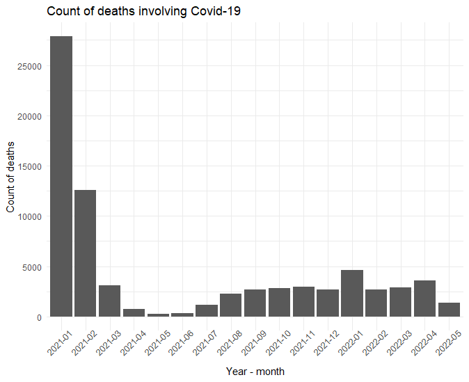
Sure enough, the count of deaths dramatically drops as the vaccination rollout picks up in early 2021.
The calculation I made in my simple world example is of course a drastic simplification of the real process in hand. After all there may have been different lockdown rules altering behaviour over time, a different set of people may be getting exposed to the virus in different ways, new variants emerged, more people have caught the illness and developed some natural immunity, and unfortunately some of the most vulnerable will have died in the early days.
So we can’t take the my chart above as proof that the vaccines were the cause of the lowering death counts. For that, the best evidence would need to come from the large, well-run published vaccine trials (which were done, and showed exactly that).
But the huge drop in deaths that occurred just as the vaccines were being rolled out is exactly what we’d expect to see in the real world if the vaccines were effective. The overall count of Covid deaths has declined dramatically in a time period where the amount of people who have become vaccinated has increased, which would fit this theory. Even without further evidence of causation, I imagine most people looking at the time series chart above whose priority is to not die of Covid would rather live in the world of May 2022 than January 2021.
The radical difference in group sizes and their change over time shows us that for a meaningful answer to the question of “is it likely a vaccine would change my chances of dying of Covid?” we need to look measures that take the differences in the number of people in the vaccinated and unvaccinated groups into account.
The average immunity level of the unvaccinated will have increased as more and more of the surviving unvaccinated people catch the disease
The pro-herd immunity strategy folk are certainly correct that catching Covid-19 gives you a level of natural immunity; that is how the immune system works. Unfortunately the downside of achieving immunity via catching Covid-19 is that….you catch Covid-19.
As we’ve seen above, one of its side-effects is death, but even for the majority who do recover there’s the experience of living with whichever level of symptoms they were lucky or unlucky enough to have experienced, and the possibility of various degrees of long Covid. They’re also infectious for a while, so risk passing it on to anyone else they’re hanging out with.
If we are happy with the idea that not being vaccinated means you’re more likely to catch Covid and/or suffer worse symptoms if you do, then with that comes a couple of implications.
Firstly the non-vaccinated people most vulnerable to Covid will have been at high risk of dying. You can only die once. So, 2 years in, a relatively higher proportion of the people who would have been at a high risk of death from Covid from the unvaccinated group are no longer with us. In isolation this would mean that we’re now comparing on average “Unvaccinated people with low levels of vulnerability to Covid death” to “Vaccinated people with average levels of vulnerability to Covid death”.
In reality, as vaccination deployment focussed on people with the higher levels of vulnerability the situation is even more skewed. We’re potentially really comparing “Unvaccinated people with below average levels of vulnerability to death” to “Vaccinated people with above average levels of vulnerability to death”.
Now thinking about the large majority of unvaccinated people who thankfully are still with us, many of them will have natural immunity now by virtue of having caught Covid-19 in the past. I couldn’t quickly find estimates of what percentage of the unvaccinated have had Covid-19 in the past, but there are estimates out there of the total proportion of the English population who has had Covid at least once.
At the time of writing, the current estimate is that around 5% of the English population have Covid right now. But your protection is potentially dependent on whether you’ve ever had it in the past, not only whether you have it now.
The latest ONS report on the presence of antibodies within the population of England estimates that 97.1% of the English population have SARS-CoV-2 antibodies. Antibodies are produced both when a person has been previously infected by COVID-19 and when they are vaccinated. So all we can really say from that particular figure is that there’s likely only a tiny proportion of the English who haven’t already got some level Covid-19 immunity.
The ONS’ Coronavirus (COVID-19) Infection Survey estimated that around 71% of the British population had Covid – the disease itself, rather than the vaccine – between 27th April 2020 and 11 February 2022.
A more recent analysis by the Financial Times, since the Omicron variant emerged, suggests that it may now be more like 90%.
Those figures aren’t split by vaccination status, but even if the vaccine itself offered no protection from catching Covid-19 at all – a position that is not at all supportable by the evidence but even so – I’d imagine the majority of unvaccinated people that have survived so far likely now have, or have had, some level of immunity from Covid-19.
To be clear, several studies (e.g. 1, 2, 3) have suggested that whilst someone who has recently had Covid will most often have some natural immunity against a second bout, they will usually get a meaningful amount of extra protection from future episodes of Covid if they also get vaccinated. Hence the standard recommendation is to complete your course of vaccines even if you’ve already suffered from the illness.
I’m not sure how worthy of note this is, but, for what it’s worth, antibodies weren’t detectable in a certain percentage of those who had had Covid-19 in one study .
Irrespective of the exact figures, we’re certainly not in the situation at the start of the pandemic (and during the original vaccine trials) whereby anyone not yet vaccinated was likely entirely unprotected.
Thus we’re now comparing “People who are vaccinated” to “Unvaccinated people who on average likely have some natural immunity against Covid”, as opposed to the original, more intuitive, comparison group of “Unvaccinated people who don’t have any special immunity”. Naturally, a smaller difference will be seen.
The characteristics of people in the vaccinated group differ from those in the unvaccinated group in a way that makes them more likely to die from Covid.
A part of this we already covered up above. The UK Covid vaccine rollout prioritised those at greater risk of suffering severe consequences from Covid. Vaccines were made available to them earlier. In the case of the most vulnerable, they are also entitled to an extra dose, the so-called Spring booster.
This rollout strategy is unlike how the original clinical trials on the vaccines were run, which were randomised controlled trials. The randomised part of that means that within the trial the characteristics of the people were vaccinated were similar to those that were not vaccinated, plus or minus a bit of random noise. That’s one of the fundamental requirements needed for these trials to perform a fair comparison between vaccinated and unvaccinated people.
There’s thought to be a bunch of different conditions that make one on average more or less vulnerable to severe consequences, including death, from Covid. Probably the most widely known one is age. Older people are more likely to die from catching Covid than younger people are. Hence a lot of the UK’s vaccine eligibility at first depended on being of a certain age.
And the risk differential is big! The risk of dying if you catch Covid basically halves for each 6-7 years younger you are. This is a huge difference. According to Spiegelhalter and Masters, this means that an 80 year old who has had two vaccines is far, far safer than the same-aged person who hasn’t. But they’re not 100% safe. They still have a similar level of risk as a 50 year old who didn’t get the vaccines.
Another way to look at this would be to select people of a certain age as a reference group and then look at how the risk of death from Covid compares to the reference group. The CDC did that here, partially represented by this table:
| Rate compared to 18-29 years old | 0-4 years old | 5-17 years old | 18-29 years old | 30-39 years old | 40-49 years old | 50-64 years old | 65-74 years old | 75-84 years old | 85+ years old |
| Death | <1x | <1x | Reference group | 4x | 10x | 25x | 60x | 140x | 330x |
We can see that older folk are literally hundreds of times more likely to die from Covid than young adults.
For this to be a potentially significant factor in data we’re looking at, one key thing we would need to know is whether that as of April/May 2022 were there still a higher proportion of older people in the vaccinated group? After all, for quite some time now the UK has made at least the first 3 vaccines available to everyone (at least adults, I’ve not been following the rules for children). It could be that vaccine status is randomly distributed amongst the ages now.
But it isn’t. Here I’ve taken a graph the BBC created from the Government’s dashboard from March 2022, where it seems like the vaccination uptake rates had levelled out for most age groups.
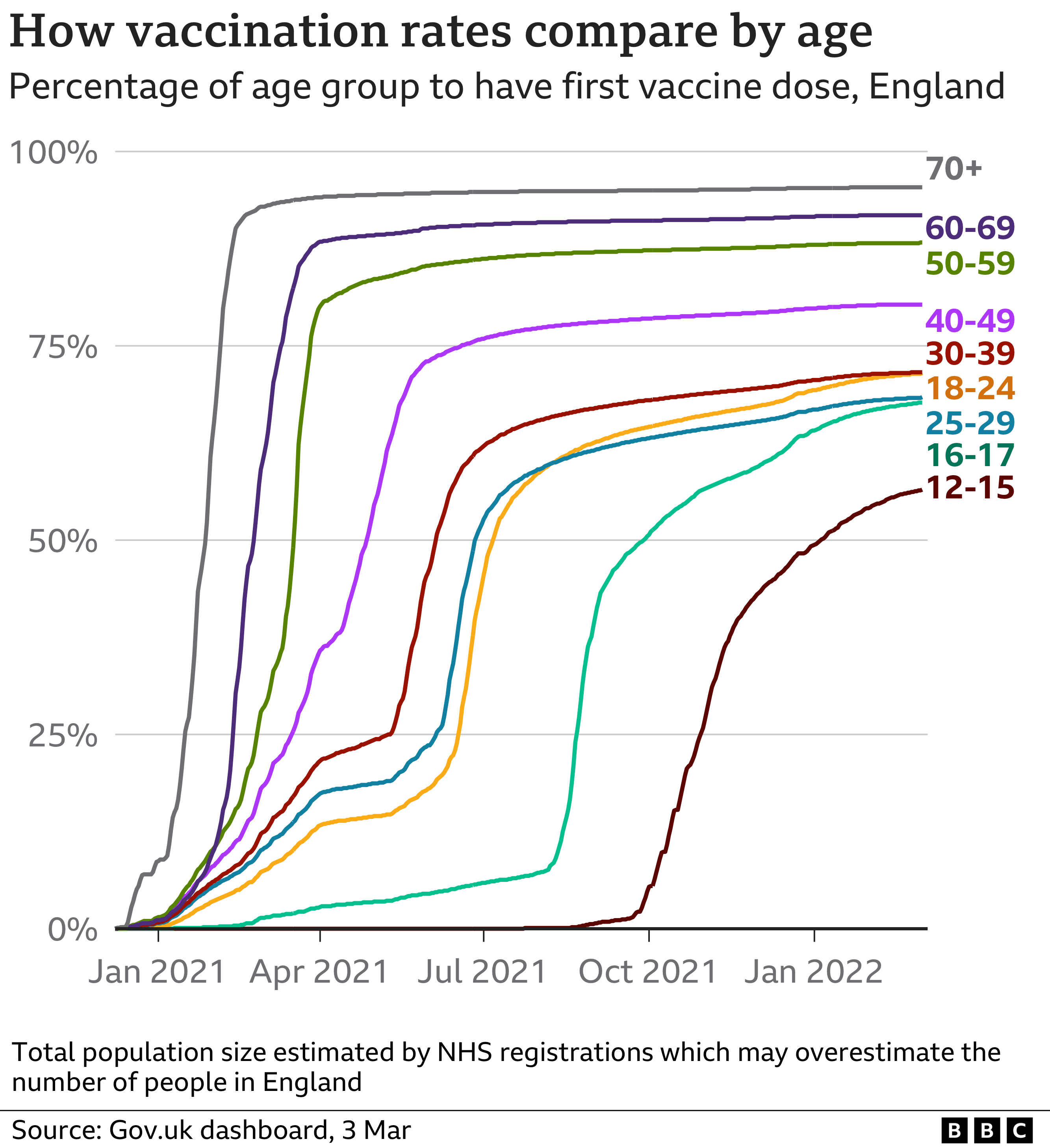
It’s immediately apparent that the older someone is, the more likely it is that they’ve had a vaccine.
Thus the unvaccinated population will have a much higher percentage of people in it that, based on their age, are far less likely to die of Covid if they get it than if someone in the vaccinated population experienced a breakthrough infection.
This is a logical enough outcome; intuitively, the higher your risk the more urgent you may see seeking protection as. We should remember though that the wealth of evidence is in the direction such that obtaining a vaccine provides useful protection against both getting and suffering from Covid for all eligible ages. Risk of death is not the only reason you’re usually better off not getting Covid.
Even outside of Covid times, older people tend to be more likely to die from most causes than younger people. This is extremely intuitive, but for the more data driven readers, it can also be seen in the values any general actuarial table produces when looking at the probability of dying within the next year – here’s an example.
The relevance of this is increased by the definition of “involving Covid” that the original dataset uses. Taking the definition from the “Definitions” tab of the datafile, a death involving Covid here is:
…referring only to deaths where COVID-19 is mentioned anywhere on the death certificate.
For further details on death coding they refer us to The User Guide to Mortality Statistics.
The upshot is that Covid-19, whilst present, was not necessarily the main cause of death.
I couldn’t easily find a nice time series showing what proportion of “involving Covid” deaths were thought to have Covid as the primary cause over time. But at the time of writing the ONS is reporting that for the week exceeding 15th July 2022, it’s 65.3%, and was 61.9% the week before.
From a response under the Freedom of Information Act, the ONS has elaborated on what “deaths involving Covid-19” include.
When we say that a death ‘involved’ COVID-19, we mean that COVID-19 was mentioned anywhere on the death certificate, possibly along with other health conditions, not necessarily as the underlying cause of death.
Contrast this with:
When we say that a death was ‘due to’ COVID-19, we mean that COVID-19 was the underlying cause of death, because it was either the only health condition mentioned on the death certificate, or it was the one that started the train of events leading to death.
So for a death to have involved Covid then it could either have been caused by Covid – i.e. the sole cause of death or the first condition in a casual series of conditions that eventually led to death – or it could have listed under part 2 of the death certificate as a “condition contributing to the death but not related to the disease or condition causing it”.
Deaths in situations that no-one thinks could possibly be related to Covid, such as dying in a traffic accident whilst you happened to have Covid, would not have Covid listed as a contributory cause. Hence these folk are not be included in our “deaths involving Covid-19” stats.
I don’t have the expertise to be extremely confident in this interpretation, but I read the above as saying maybe a third of deaths “involving Covid” in recent times are primarily caused by something else, albeit something that in theory Covid-19 could have exacerbated.
If so, as the vaccinated group contains on average older people who are already more likely to die of other causes, then there will also be an over-representation of people in that group who died for another reason, potentially having Covid even when it wasn’t the primary cause of death. And a Covid vaccine is unlikely to offer protection against non-Covid related causes of death! Although presumably it could be considered a kind of protective factor in situations where the cause of death is exacerbated by Covid.
So what can we do to get an idea of how much this kind of effect may have contributed to the original observation that a much higher proportion of deaths involving Covid in recent weeks were from vaccinated people?
If our motivating question is something like “should I take the vaccine to prevent me dying from Covid?” then we’d get much closer to the insight we want by comparing the rates, rather than counts, of deaths from people in each group who are in all important factors except vaccination status equally as likely to die of Covid.
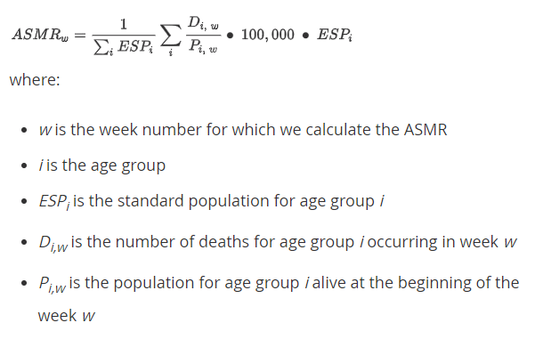
Nothing in this dataset can let us do this perfectly, but the authors have provided a field that lets us deal with the huge impact that age has on the likelihood of Covid being fatal to a person. The dataset comes with an “age standardised mortality rate” measure.
As a non-expert in ONS data, rather than blindly accept that measure, I wanted to learn more about how exactly it was calculated. Historically I’m sure we could find instances in the vast canon of science where a researcher has “adjusted” for some variable in a way that is controversial or even misleading.
It does seem unlikely that an organisation with the size, expertise and at the receiving end of as much scrutiny as the ONS is would be doing something flagrantly misleading, but it never hurts to understand more about what exactly the numbers we see on a spreadsheet mean.
Fortunately they provide a detailed description of their methodology.
Unfortunately for non-statisticians, it’s not exactly intuitive to decipher.
However it turns out that this is perfectly standard practice and relatively – only relatively I admit! – easy to understand if we work through a simple example.
An example of an age standardisation calculation
Firstly, if you prefer learning via video rather than reading text, I thought the below video explained the concept well. I believe the publishers of the Covid deaths data file we are looking at are using what the video refers to as the “direct” form of age standardisation.
For anyone who prefers reading text with a fair few calculations sprinkled within it, here we go:
First we need the concept of the “standard population”. Here that’s basically a population defined by the proportion of people in it that are of certain ages. For example, perhaps 10% of people in the selected “standard” population are aged 18-25, whereas 20% are 26-34 etc.
Our goal is going to be to determine the rate of deaths we’d expect to see if the actual population being studied had the same proportional age breakdown as this standard population.
To make it easy for ourselves in the following toy example, let’s pretend there are only 2 ages; young and old. And that we define our reference “standard population” as being one where 50% of people are young and 50% of people are old.
Now, for the purposes of this example. let’s imagine the entire population of the country being studied is just 2000 people, broken down like this:
- 600 are young and unvaccinated
- 400 are young and vaccinated
- 200 are old and unvaccinated
- 800 are old and vaccinated
Whilst these numbers are entirely fictional, in order to help with our intuitions here I’m trying to keep to the basic pattern that the scientific consensus holds for UK Covid death rate. So older people are both more likely to die in my example, and also more likely to get vaccinated.
Now imagine we saw the following number of deaths occur:
- 60 young unvaccinated people die
- 20 young vaccinated die
- 100 old unvaccinated die
- 200 old vaccinated die.
Overall then that’s 160 unvaccinated deaths and 220 vaccinated deaths.
Note that there are more deaths in the vaccinated population. Nearly 60% of the deaths are from vaccinated folk! Is our vaccine dangerous?
As we mentioned in the assumptions above, we’ve think that old people are more likely to die. So how then can we adjust the numbers such that both the vaccinated and unvaccinated groups are adjusted to have the same age breakdown as our standard population? Which we defined as 50% young, 50% old.
So we know in the unvaccinated group we saw
- 60 young people die from 600 in total.
- 100 old people die from 200 in total.
So there were 3x as many young people than old in that group. We really want to know what the overall death rate would have been for unvaccinated folk if the age breakdown of them had matched our selected standard population, where young to old split 50:50, not 75:25.
So let’s multiply the results from the 200 old people by 3 to get the same number of old unvaccinated people in total as there were young unvaccinated. That’d be 200 * 3 = 600 old people, with 100 * 3 = 300 deaths.
Add these to the results from the 600 young unvaccinated people and we end up with a total unvaccinated population of 1200 people (600 old + 600 young), with 300 + 60 = 360 deaths.
In a world with a 50:50 split of old vs young then, the death rate in unvaccinated people would be 360 / 1200 = 30%
Now we need to do the same thing with the vaccinated group. We saw:
- 20 young people die from 400 in total.
- 200 old people die from 800 in total.
This time there’s twice as many old people as there are young people. So let’s double the counts for young people, getting 40 deaths from 800 young people.
Add those to the 200 from 800 old people to get a total of 240 deaths from 1600 people in a world with a standard population of 50:50 old to young.
So in a world with a 50:50 split of old vs young then, the death rate in vaccinated people would be 240 / 1600 = 15%.
In line with convention, the authors of the original data file report these figures as a “deaths out of 100,000 people” type figure rather than a percentage. So here’s we’d say the age standardised mortality rate in our standard population is:
Vaccinated deaths per 100k = 100000 * 15% = 15,000
Unvaccinated deaths per 100k = 100000 * 30% = 30,000.
Another, more concise, way of expressing the same approach would be:
- Calculate the “age specific” rate of deaths for both of the unvaccinated age groups.
- Multiply by 100,000 to get rate per 100k people.
- Multiply each of those numbers separately by proportion of people in your standard population that are of the relevant age.
- Add the two numbers from bullet 3 together to give you the age standardised mortality rate per 100k people.
- Repeat the whole for the vaccinated folk and compare the two answers you get from point 4.
Try that, and you should arrive at the same answer.
So in this fictional example, we had originally seen a higher number of deaths from unvaccinated folk. But once we adjusted the results so both groups match the age profile of the standard population (and hence by definition each other), we find that once we control for age in this way we now see twice as many unvaccinated deaths as vaccinated. Our imaginary vaccine, all other things being equal, seems to work!
The one added nuance to note with regards to the data file behind the original chart is that they are measuring the age standardised mortality rate per 100,000 person years, not per 100,000 people.
This is because they’re looking at figures over time. A single person might be unvaccinated one week and then vaccinated the next, so they have to ensure they correctly contribute towards the figures based on their vaccination status at the time – not their final vaccination status. It’s conceptually harder to visualise, but the math and interpretation of the differences between two groups remains the same. Higher age standardised mortality rates expressed in terms of person years still imply a higher risk of death after your age has been taken into account.
A final note is that the real ONS stats of course have a lot more age brackets than the “young” and “old” from my example. This is particularly necessary for an illness such as Covid where the prognosis is so dramatically affected by age. They use the 2013 European Standard Population age breakdown which can be seen in table 7 of their methodology document.
So now we hopefully buy into the idea that using age-based standard populations provides a fairer way to compare mortality rates between otherwise age-incompatible groups, what do we see with the dataset in the file that started this all off?
Using the same rows of data as the original chart used, April and May 2022, but this time looking at the age standardised mortality rate, we see:
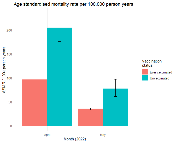
By the nature of this type of analysis there is some statistical uncertainty, represented by the error bars showing 95% confidence intervals. But it’s very clear that once the 2 populations have been adjusted for age the death rate in the vaccinated sample is much lower than that in the unvaccinated sample. The unvaccinated people are on average more than twice as likely to die as the vaccinated people are.
To avoid having to accuse myself of the same cherry picking that the authors of the initial chart did, here’s the same data for the entire time series. Whilst the differences between the two groups have changed over time, there’s not a single month where the rate of vaccinated people dying was higher than the unvaccinated group when age is controlled for.

Now age standardisation isn’t a magical fix to all the problems one encounters when comparing observational data from two self-selected groups. The only thing it controls for is age. In reality, due to the rules around who was eligible for a vaccine in the UK there would likely be an additional bias towards the most vulnerable of the younger people being in the vaccinated group too. This would have the effect of making the vaccinated group rates look relatively “worse” than that they really are – so the age standardised chart likely understates any benefit of the vaccine in that respect.
The ONS notes the possibilities of these outstanding biases in the 9th note attached to the file.
Caution must be taken when comparing mortality rates and counts as the characteristics of people in the different vaccination status groups, such as health, may differ, particularly due to the prioritisation of the vaccine to more clinically vulnerable people. While differences in the ages of people in the vaccination status groups are accounted for, other differences, such as ethnicity or level of deprivation, may remain, which can affect the mortality rates and counts.
However there’s no data in this file that can let us dig into that further.
The best way to “control for everything” is by performing a well-designed randomised control trial. Happily, the appropriate regulations ensured that each of the available vaccines featured in studies of those type before they were permitted to be used.
Whilst no vaccine is either 100% effective or 100% risk free, each of the ones the UK uses showed a high – in fact surprisingly high – health benefit, with very low risk of serious side effects, in the environment that existed at the time. Since then, literally hundreds of thousands of Covid-19 related scientific papers have been published, and many organisations continue to monitor the progress of the pandemic and humanity’s response, including the ongoing efficacy of vaccines.
For those of us in the UK, the details of how the Covid vaccines are being proactively monitored by the UK Health Security Agency, the Medicines and Healthcare Regulatory Agency, NHS England, and other organisations can be seen in this strategy document.
The MHRA in particular is tasked with continuously monitoring the safety of vaccines, including the Covid-19 ones. Their latest report based on the Yellow Card reporting scheme is currently here. If you feel you may have experienced any side effects from vaccines or other medications that haven’t already been reported by your healthcare provider, you can use the Yellow Card reporting site to share your experience with them.
