Several interesting phenomena can be modelled and analysed using graph theory. Graph theory, which Wikipedia tells me first had a paper published about it in 1736 (!) can at its most basic perhaps be thought of as mathematical techniques to analyse problems where one can represent the protagonists as a set of objects (nodes) and lines connecting them (edges).
A common example would be analysis of social networks (each person is a node, each friendship connecting them an edge), referral schemes (people involved are nodes, the act of referring them are edges) or in a more physical sense perhaps transport (each airport a node, each flight between them an edge).
Most common business analysis tools I have seen do not really try and tackle the classic graph/network visualisations between objects very well. So far it seems it hasn’t been a traditional avenue of analysis for most businesses, but as the most obvious application, “social data”, becomes ever more interesting I’m sure interest will only rise.
 Luckily there is a pretty awesome tool. Not only is it super-fully-featured in this sphere, but it’s licensed under Gnu GPL, and hence free! Kudos to the heros who create and maintain Gephi.
Whilst it produces research publication level output and has no shortage of advanced features, coming to it originally as a total graph-novice I did not find it overly easy to use. This is no slight on the software; my sense is the sheer power of it and target audience is not conducive to a hand-holding wizard type system, especially when it’s a labour of love!
Here then follows a few notes on how to get the most basic data from a spreadsheet on one’s computer into Gephi, and how to visualise a stupidly simple graph from it. Of course in reality the data involved will be far larger and more interesting than this fictional example, but hopefully it helps to get started.
Here’s the data to use in this example. First my set of nodes:
| ID | Label |
| 1 | A |
| 2 | B |
| 3 | C |
| 4 | D |
| 5 | E |
| 6 | F |
| 7 | G |
| 8 | H |
| 9 | I |
| 10 | J |
Read this as saying I have 10 “objects” (e.g. people on Facebook), which have the names A, B, C etc.
and now the set of edges:
| Source | Target |
| 1 | 2 |
| 1 | 3 |
| 1 | 4 |
| 1 | 7 |
| 1 | 9 |
| 2 | 8 |
| 2 | 7 |
| 2 | 1 |
| 2 | 10 |
| 3 | 6 |
| 3 | 8 |
Read this as saying I have 11 connections (e.g. friendships between people), which involve my 10 nodes.
Note that some nodes may have no connections to other nodes, and others may have very many. Here we see that node ID 1 (“A”) has a connection to node ID 2 (“B”). This doesn’t necessarily imply that B is connected to A in our example, which makes it a “directed graph” – for instance B might be a Twitter follower of A even though A is not following B. Gephi can naturally handle both directed and undirected graphs with ease.
Note that, for Gephi, the column headers are important.
- Every node should have a column called “ID” and, if you want to show some sort of human-readable labels, then one called “Label”.
- Every edge should have a column called “Source” and one called “Target” which are the ID numbers of the nodes that should be connected (for an undirected graph like this one it doesn’t really matter which goes in source and which in target – but for 1-way friendships it would).
- You can add any other columns you like to the file, which you can then use in Gephi itself if you wish, but should always try and ensure you have at least the above ones.
Excel files must be in CSV format. So, if your data is not in CSV format, the first step is to save the data as a CSV, instead of a XLSX.
The CSV format supports only 1 “worksheet”, so you will have to create 2 files, one for the nodes and one for the edges. Technically you can just use the edges file and have Gephi assume that every entry in the edges table relates to a node it should create (and that there are no other nodes) but I find it safer at first to approach it explicitly with the separate files.
Now it’s time to open Gephi!
First, create a new project (or use the existing one) and press the “Data Laboratory” button at the top of the screen
Now choose “Import spreadsheet” from the resulting screen.

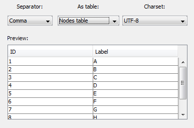
Select your nodes CSV file. Make sure the dialogue box is set to recognise your file as a “Nodes table” and not an “Edges table” or you will get an error about it being in the wrong format.
Click through to “Next” and “Finished”. You’ll see there are various importing options which are useful in more complex cases – but not needed for this example.
You’ll be returned to the “Data laboratory” screen, hopefully with your nodes data showing like this:
Note that this data is now embedded in Gephi. If you change something in your CSV it will not automatically update. Likewise there are many features in Gephi to add, remove, filter or calculate new columns which are not passed back to the CSV. Be sure to save in Gephi often!
Now, repeat that process but this time selecting to import your edges csv as a “Edges table”. You should end up with something like this when clicking on the little “Edges” button at the top left of the screen.

Now for the fun part. Switch back to the Overview section using the button at the top left of the screen. You should see your data, visualised as a graph!

It may not look super pretty at first, but you can see that it’s accomplished its task. Perhaps in a later post I will go through a few of the formatting options (Gephi can produce very, very beautiful output if one is prepared to try!) but for a few quick tips now:
At the bottom left of the main display window there are some formatting controls.

Right click and drag to pan. Use the mouse scroll button to zoom.
The button with the letter “T” applies the labels to the nodes. You may need to zoom in or adjust the size slider to the right to see them properly. This section is also where you find the basic colours, sizes etc. (there are also functions to go into later that let you colour code each node based on a variable or characteristics).
If you don’t like where a node has been physically placed on the screen there are 2 key options.
- Click it and drag it to where you prefer. Gephi will keep the edge properly connected.
- If it’s more than the odd one, or you wish to experiment with several different positioning algorithms in order to find the most effective one for your data, then note the “layout” box to the left.

Here you can have Gephi apply algorithms to fulfill certain sorting, manipulation or positioning operations, and it’s very fast, even on a lot of data. The software comes with some built in ones and there are more possibilities to download extra – more on this in a future followup. They’re quite non-destructive, so it’s quite possible to save your file and play with them – although note a lack of an actual “undo” in this software!
Some, like the one pictured have some parameters you can set and then press “Run” to actually apply it. I have had some success with “Force Atlas 2” in making sense of datasets somewhat larger than this example.
Here’s an example of how Force Atlas 2 and a bit of formatting made it clear that in the test dataset I had one lonely node, “E”, who has no connections. It’s also easy to see that A and B are amongst the most heavily connected nodes.

That’s the basics of how to get data in and on the screen covered. Gephi does far more than this; there are all sort of formatting, partitioning, ranking, calculating, filtering and many more abilities to help get insights out of graphs – but popping the data in is and having the gratification of seeing a visualised network is the first step.
Happy graphing!

Thank you 🙂
LikeLike
Thank you! Helped me get started really quickly!
LikeLike
I’m using the data in your example and setting up my csv files but I keep getting an error message when I try to import the edges file. I cant work out why???? I’m following the instructions given. HELP!
LikeLike
thanks!
LikeLike