Coming up to the election, there’s no shortage of misleading statistics, charts and downright quantitative lies being flung around. One even made it through our letterbox today. It’s far from the worst available online, but such statistical slights always feel more personal when they get physically pushed into one’s abode.
Here goes the Liberal Democrats, being honest enough to admit that their main selling point around here is that they got more votes in our area last time than the next largest party did.
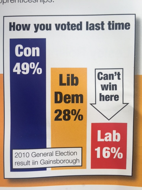
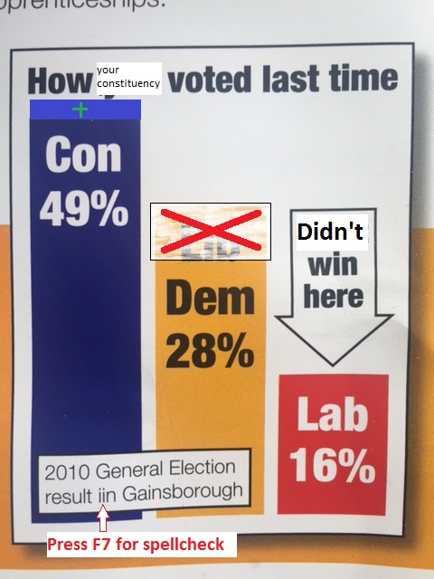
For the avoidance of doubt – my research indicates that 28% is not usually more than twice the amount of 16% on a linear scale, so I have taken the liberty of correcting the chart proportions below for a somewhat more realistic look.
Although the point that our constituency is traditionally very Conservative-with-a-big-C remains [sadly] true, the Yougov Nowcast is suggesting a very different result for place #2 at present, as shown here.
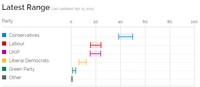
Not that I (or Yougov) would claim that that’s a done deal – but what the Lib Dem leaflet fails to mention is that the last result does not always predict the next result.
The poor Liberal Democrats were apparently recently polling at a 25-year low, behind even the previously pretty numerically insignificant UKIP and Green parties. I think it’s safe to say that the Cleggmania-fuelled 2010 election is not the best model for the current Lib Dem performance, bless them…
