Anyone who studies any amount of the history of, or the best practice for, data visualisation will almost certainly come across a handful of “classic” vizzes. These specific transformations of data-into-diagram have stuck with us through the mists of time in order to become examples that teachers, authors, conference speakers and the like repeatedly pick to illustrate certain key points about the power of dataviz.
A classic when it comes to geospatial analysis is John Snow’s “Cholera map”. Back in the 1850s, it was noted that some areas of the country had a lot more people dying from cholera than other places. At the time, cholera’s transmission mechanism was unknown, so no-one really knew why. And if you don’t know why something’s happening, it’s usually hard to take action against it.
Snow’s map took data that had been gathered about people who had died of cholera, and overlaid the locations where these people resided against a street map of a particularly badly affected part of London. He then added a further data layer denoting the local water supplies.

(High-resolution versions available here).
By adding the geospatial element to the visualisation, geographic clusters showed up that provided evidence to suggest that use of a specific local drinking-water source, the now-famous Broad Street public well, was the key common factor for sufferers of this local peak of cholera infection.
Whilst at the time scientists hadn’t yet proven a mechanism for contagion, it turned out later that the well was indeed contaminated, in this case with cholera-infected nappies. When locals pumped water from it to drink, many therefore tragically succumbed to the disease.
Even without understanding the biological process driving the outbreak – nobody knew about germs back then – seeing this data-driven evidence caused the authorities to remove the Broad Street pump handle, people could no longer drink the contaminated water, and lives were saved. It’s an example of how data visualisation can open ones’ eyes to otherwise hidden knowledge, in this case with life-or-death consequences.
But what one hears a little less about perhaps is that this wasn’t the first data-driven analysis to confront the same problem. Any real-world practising data analyst might be unsurprised to hear that there’s a bit more to the story than a swift sequence of problem identification -> data gathering -> analysis determining the root cause -> action being taken.
Snow wasn’t working in a bubble. Another gentleman, by the name of William Farr, whilst working at the General Register Office, had set up a system that recorded people’s deaths along with their cause. This input seems to have been a key enabler of Snow’s analysis.
Lesson 1: sharing data is a Very Good Thing. This is why the open data movement is so important, amongst other reasons. What if Snow hadn’t been able examine Farr’s dataset – could lives have been lost? How would the field of epidemiology have developed without data sharing?
In most cases, no single person can reasonably be expected to both be the original source of all the data they need and then go on to analyse it optimally. “Gathering data” does not even necessarily involve the same set of skills as “analysing data” does – although of course a good data practitioner should usually understand some of the theory of both.
As it happens, William Farr had gone beyond collecting the data. Being of a statistical bent, he had actually already used the same dataset himself to analytically tackle the same question – why are there relatively more cholera deaths in some places than others? He’d actually already found what appeared to be an answer. It later turned out that his conclusion wasn’t correct – but it certainly wasn’t obvious at the time. In fact, it likely seemed more intuitively correct than Snow’s theory back then.
Lesson 2: Here then is a real life example then of the value of analytical iteration. Just because one person has looked at a given dataset doesn’t mean that it’s worthless to have someone else re-analyse it – even if the former analyst has established a conclusion. This is especially important when the stakes are high, and the answer in hand hasn’t been “proven” by virtue of any resulting action confirming the mechanism. We can be pleased that Snow didn’t just think “oh, someone’s already looked at it” and move on to some shiny new activity.
So what was Farr’s original conclusion? Farr had analysed his dataset, again in a geospatial context, and seen a compelling association between the elevation of a piece of land and the number of cholera deaths suffered by people who live on it. In this case, when the land was lower (vs sea level for example) then cholera deaths seemed to increase.
In June 1852, Farr published a paper entitled “Influence of Elevation on the Fatality of Cholera“. It included this table:
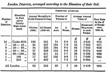
The relationship seems quite clear; cholera deaths per 10k persons goes up dramatically as the elevation of the land goes down.
Here’s the same data, this time visualised in the form of a linechart, from a 1961 keynote address on “the epidemiology of airborne infection”, published in Bacteriology Reviews. Note the “observed mortality” line.

Based on that data, his elevation theory seems a plausible candidate, right?
You might notice that the re-vizzed chart also contains a line concerning the calculated death rate according to “miasma theory”, which seems to have an outcome very similar on this metric to the actual cholera death rate. Miasma was a leading theory of disease-spread back in the nineteenth century, with a pedigree encompassing many centuries. As the London Science Museum tells us:
In miasma theory, diseases were caused by the presence in the air of a miasma, a poisonous vapour in which were suspended particles of decaying matter that was characterised by its foul smell.
This theory was later replaced with the knowledge of germs, but at the time the miasma theory was a strong contender for explaining the distribution of disease. This was probably helped because some potential actions one might take to reduce “miasma” evidently would overlap with those of dealing with germs.
After analysing associations between cholera and multiple geo-variables (crowding, wealth, poor-rate and more), Farr’s paper selects the miasma explanation as the most important one, in a style that seems quite poetic these days:
From an eminence, on summer evenings, when the sun has set, exhalations are often seen rising at the bottoms of valleys, over rivers, wet meadows, or low streets; the thickness of the fog diminishing and disappearing in upper air. The evaporation is most abundant in the day; but so long as the temperature of the air is high, it sustains the vapour in an invisible body, which is, according to common observation, less noxious while penetrated by sunlight and heat, than when the watery vapour has lost its elasticity, and floats about surcharged with organic compounds, in the chill and darkness of night.
The amount of organic matter, then, in the atmosphere we breathe, and in the waters, will differ at different elevations; and the law which regulates its distribution will bear some resemblance to the law regulating the mortality from cholera at the various elevations.
As we discover later, miasma theory wasn’t correct, and it certainly didn’t offer the optimum answer to addressing the cluster of cholera cases Snow examined.But there was nothing impossible or idiotic about Farr’s work. He (as far as I can see at a glance) gathered accurate enough data and analysed them in a reasonable way. He was testing a hypothesis that was based on the common sense at the time he was working, and found a relationship that does, descriptively, exist.
Lesson 3: correlation is not causation (I bet you’ve never heard that before 🙂 ). Obligatory link to the wonderful Spurious Correlations site.
Lesson 4: just because an analysis seems to support a widely held theory, it doesn’t mean that the theory must be true.
It’s very easy to lay down tools once we seem to have shown that what we have observed is explained by a common theory. Here though we can think of Karl Popper’s views of scientific knowledge being derived via falsification. If there are multiple competing theories in play, the we shouldn’t assume certainty that the dominant one is correct until we have come up with a way of proving the case either way. Sometimes, it’s a worthwhile exercise to try to disprove your findings.
Lesson 5: the most obvious interpretation of the same dataset may vary depending on temporal or other context.
If I was to ask a current-day analyst (who was unfamiliar with the case) to take a look at Farr’s data and provide a view with regards to the explanation of the differences in cholera death rates, then it’s quite possible they’d note the elevation link. I would hope so. But it’s unlikely that, even if they used precisely the same analytical approach, they would suggest that miasma theory is the answer. Whilst I’m hesitant to claim there’s anything that no-one believes, for the most part analysts will probably place an extremely low weight on discredited scientific theories from a couple of centuries ago when it comes to explaining what data shows.
This is more than an idealistic principle – parallels, albeit usually with less at stake, can happen in day-to-day business analysis. Preexisting knowledge changes over time, and differs between groups. Who hasn’t seen (or had of being) the poor analyst who revealed a deep, even dramatic, insight into business performance predicated on data which was later revealed to have been affected by something entirely different.
For my part, I would suggest to learn what’s normal, and apply double-scepticism (but not total disregard!) when you see something that isn’t. This is where domain knowledge is critical to add value to your technical analytical skills. Honestly, it’s more likely that some ETL process messed up your data warehouse, or your store manager is misreporting data, than overnight 100% of the public stopped buying anything at all from your previously highly successful store for instance.
Again, here is an argument for sharing one’s data, holding discussions with people outside of your immediate peer group, and re-analysing data later in time if the context has substantively changed. Although it’s now closed, back in the deep depths of computer data viz history (i.e. the year 2007), IBM launched a data visualisation platform called “Many Eyes”. I was never an avid user, but the concept and name rather enthralled me.
Many Eyes aims to democratize visualization by providing a forum for any users of the site to explore, discuss, and collaborate on visual content…
Sadly, I’m afraid it’s now closed. But other avenues of course exist.
In the data-explanation world, there’s another driving force of change – the development of new technologies for inferring meaning from datapoints. I use “technology” here in the widest possible sense, meaning not necessarily a new version of your favourite dataviz software or a faster computer (not that those don’t help), but also the development of new algorithms, new mathematical processes, new statistical models, new methods of communication, modes of thought and so on.
One statistical model, commonplace in predictive analysis today, is logistic regression. This technique was developed in the 1950s, so was obviously unavailable as a tool for Farr to use a hundred years beforehand. However, in 2004, Bingham et al. published a paper that re-analysed Farr’s data, but this time using logistic regression. Now, even here they still find a notable relationship between elevation and the cholera death rate, reinforcing the idea that Farr’s work was meaningful – but nonetheless conclude that:
Modern logistic regression that makes best use of all the data, however, shows that three variables are independently associated with mortality from cholera. On the basis of the size of effect, it is suggested that water supply most strongly invited further consideration.
Lesson 6: reanalysing data using new “technology” may lead to new or better insights (as long as the new technology is itself more meritorious in some way than the preexisting technology, which is not always the case!).
But anyway, even without such modern-day developments, Snow’s analysis was conducted, and provided evidence that a particular water supply was causing a concentration of cholera cases in a particular district of London. He immediately got the authorities to remove the handle of the contaminated pump, hence preventing its use, and hundreds of people were immediately saved from drinking its foul water and dying.
That’s the story, right? Well, the key events themselves seem to be true, and it remains a great example of that all-too-rare phenomena of data analysis leading to direct action. But it overlooks the point that, by the time the pump was disabled, the local cholera epidemic had already largely subsided.
The International Journal of Epidemiology published a commentary regarding the Broad Street pump in 2002, which included a chart using data taken from Whitehead’s “Remarks on the outbreak of cholera in Broad Street, Golden Square, London, in 1854” paper, which was published in 1867. The chart shows, quite vividly, that by the date that the handle of the pump was removed, the local cholera epidemic that it drove was likely largely over.

As Whitehead wrote:
It is commonly supposed, and sometimes asserted even at meetings of Medical Societies, that the Broad Street outbreak of cholera in 1854 was arrested in mid-career by the closing of the pump in that street. That this is a mistake is sufficiently shown by the following table, which, though incomplete, proves that the outbreak had already reached its climax, and had been steadily on the decline for several days before the pump-handle was removed
Lesson 7: timely analysis is often vital – but if it was genuinely important to analyse urgently, then it’s likely important to take action on the findings equally as fast.
It seems plausible that if the handle had been removed a few days earlier, many more lives could have been saved. This was particularly difficult in this case, as Snow had the unenviable task of persuading the authorities too take action based on a theory that was counter to the prevailing medical wisdom at the time. At least any modern-day analysts can take some solace in the knowledge that even our highest regarded dataviz heroes had some frustration in persuading decision makers to actually act on their findings.
This is not at all to reduce Snow’s impact on the world. His work clearly provided evidence that helped lead to germ theory, which we now hold to be the explanatory factor in cases like these. The implications of this are obviously huge. We save lives based on that knowledge.
Even in the short term, the removal of the handle, whilst too late for much of the initial outbreak, may well have prevented a deadly new outbreak. Whitehead happily acknowledged this in his article.
Here I must not omit to mention that if the removal of the pump-handle had nothing to do with checking the outbreak which had already run its course, it had probably everything to do with preventing a new outbreak; for the father of the infant, who slept in the same kitchen, was attacked with cholera on the very day (Sept. 8th) on which the pump-handle was removed. There can be no doubt that his discharges found their way into the cesspool, and thence into the well. But, thanks to Dr. Snow, the handle was then gone.
Lesson 8: even if it looks like your analysis was ignored until it was too late to solve the immediate problem, don’t be too disheartened – it may well contribute towards great things in the future.
