R is a wonderful, flexible, if somewhat arcane tool for analytics of all kinds. Part of its power, yet also its ability to bewilder, comes from the fact that there are so many ways of doing the same, or similar, things. Many of these ways are instantly available thanks to many heroes of the R world creating and distributing free libraries to refine existing functionality and add new abilities.
Looking at a list of one from the most popular sources for these packages, CRAN, shows that their particular collection gets new entries on a several-times-per-day basis, and there are 11,407 of them at the time of writing.
With that intimidating stat in mind, I will keep a few notes on this blog as to my current favourite base or package-based methods for some common analytics tasks. Of course these may change regularly, based on new releases or my personal whims. But for now, let’s tackle correlations. Here I mean simple statistical correlations between 2 sets of data, the most famous one of which is likely the Pearson correlation coefficient, aka Pearson’s R.
What would I like to see in my ideal version of a correlation calculator? Here’s a few of my personal preferences in no particular order.
- Can deal with multiple correlation tests at once. For example, maybe I have 5 variables and I’d like to see the correlation between each one of them with each of the other 4 variables).
- Visualises the results nicely, for example in a highlighted correlation matrix. Default R often produces informative but somewhat uninspiring text output. I have got spoiled with the luxury of data visualisation tools so after a heavy day’s analysis I prefer to take advantage of the many ways dataviz can make analytic output easier to decipher for humans.
- If the output is indeed a dataviz, I have a slight preference for it to use ggplot charting all other things being equal. Ending up with a proper ggplot object is nice both in terms of the default visual settings vs some other forms of R chart, and also that you can then in theory use ggplot methods to adapt or add to it.
- Can produce p values, confidence intervals, or some other way of suggesting whether any correlations found are statistically significant or not.
- Can handle at least a couple of types of correlation calculations, the most common of which are probably Pearson correlation coefficient and Spearman’s rank correlation coefficient.
Default R has a couple of correlation commands built in to it. The most common is probably “cor“. Here’s an example of what it produces, using a test dataset named test_data of 5 variables, named a, b, c, d and e (which are in columns .
cor(test_data)
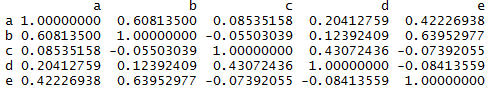
So, it does multiple tests at once, and can handle Pearson, Spearman and Kendall correlation calculations, via changing the “method” parameter (which defaults to Pearson if you don’t specify, as in my example). But it doesn’t show the statistical significance of the correlations, and a potentially large text table of 8-place decimal numbers is not the sort of visualised output that would help me interpret the results in a particularly efficient way.
A second relevant default R command is “cor.test“. This one only allows you to make a single correlation comparison, for example between variable a and variable b.
cor.test(test_data$a, test_data$b)
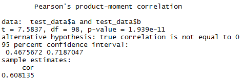
So here we see it does return both a p value and a confidence interval to help us judge the significance of the correlation size noted. You can change the alternative hypothesis and confidence interval range via parameters. It can also do the same 3 types of correlation that “cor” supports. But, as noted, it can only compare two variables at once without further commands. And the output is again a bunch of text. That is really OK here, as you are focusing only on one comparison. But it’s going to be pretty tedious to run and decipher if you want to compare each one of a few variables against each of the others.
So, is there a package solution that makes me happy? As you might guess, yes, there’s actually a few contenders. But my current favourite is probably “ggcorrplot“. The manual is here, and there’s a handy usage guide here.
Suffice to say:
- It allows you to compare several variables against each other at the same time.
- It visualises the variables in a colour-coded correlation matrix
- The visualisation is a ggplot
- It can produce p values, using the accompanying function cor_pmat(), which can then be shown on the visualisation in various ways.
- It uses the results from the built in cor() function, so can handle the same 3 types of correlation.
There’s a bunch of options to select from, but here’s the default output
# calculate correlations using cor and store the results
corrdata <- cor(test_data)

# use the package's cor_pmat function to calculate p-values for the correlations
p.mat <- cor_pmat(test_data)

# produce a nice highlighted correlation matrix
ggcorrplot(corrdata, title = "Correlation matrix for test data")
The results look like:

You can see it produces a correlation matrix, colour coded as to the direction and strength of the correlations. It doesn’t show anything about the statistical significance. Kind of pretty for an overview glance, but it could be rather more informative.
I much prefer to use a couple of options that show the actual correlation values and the significance; the ones I most commonly use probably being this set.
ggcorrplot(corrdata, title = "Correlation matrix for test data", lab=TRUE, p.mat = p.mat, sig.level = .05)

Here, the correlation coefficients are superimposed on the grid, so you can check immediately the strength of the correlation rather than try and compare to the colour scale.
You can also see that some of the cells are crossed out (for example the correlation between variable c and variable e in the above). This means that the correlation detected is not considered to be significant at the 0.05 level. That level can be changed, or the insignificant correlations be totally hidden if you prefer to not get distracted by them in the first place.
