Back for the next part of the “which of the infinite ways of doing a certain task in R do I most like today?” series. This time, what could more more fascinating an aspect of analysis to focus on than: frequency tables?
OK, most topics might actually be more fascinating. Especially when my definition of frequency tables here will restrict itself to 1-dimensional variations, which in theory a primary school kid could calculate manually, given time. But they are such a common tool, that analysts can use for all sorts of data validation and exploratory data analysis jobs, that finding a nice implementation might prove to be a time-and-sanity saving task over a lifetime of counting how many things are of which type.
Here’s the top of an example dataset. Imagine a “tidy” dataset, such that each row is an one observation. I would like to know how many observations (e.g. people) are of which type (e.g. demographic – here a category between A and E inclusive)
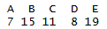
| Type | Person ID |
|---|---|
| E | 1 |
| E | 2 |
| B | 3 |
| B | 4 |
| B | 5 |
| B | 6 |
| C | 7 |
I want to be able to say things like: “4 of my records are of type E”, or “10% of my records are of type A”. The dataset I will use in my below example is similar to the above table, only with more records, including some with a blank (missing) type.
What would I like my 1-dimensional frequency table tool to do in an ideal world?
- Provide a count of how many observations are in which category.
- Show the percentages or proportions of total observations that represents
- Be able to sort by count, so I see the most popular options at the top – but only when I want to, as sometimes the order of data is meaningful for other reasons.
- Show a cumulative %, sorted by count, so I can see quickly that, for example, the top 3 options make up 80% of the data – useful for some swift Pareto analysis and the like.
- Deal with missing data transparently. It is often important to know how many of your observations are “missing”. Other times, you might only care about the statistics derived from those which are not missing.
- If an external library, then be on CRAN or some other well supported network so I can be reasonably confident the library won’t vanish, given how often I want to use it.
- Output data in a “tidy” but human-readable format. Being a big fan of the tidyverse, it’d be great if I could pipe the results directly into ggplot, dplyr, or whatever for some quick plots and manipulations. Other times, if working interactively, I’d like to be able to see the key results at a glance, without having to use further coding.
- Work with “kable” from the Knitr package, or similar table output tools. I often use R markdown and would like the ability to show the frequency table output in reasonably presentable manner.
- Have a sensible set of defaults (aka facilitate my laziness).
So what options come by default with base R?
Most famously, perhaps the “table” command.
table(data$Type)
A super simple way to count up the number of records by type. But it doesn’t show percentages or any sort of cumulation. By default it hasn’t highlighted that there are some records with missing data. It does have a useNA parameter that will show that though if desired.
table(data$Type, useNA = "ifany")
The output also isn’t tidy and doesn’t work well with Knitr.
The table command can be wrapped in the prop.table command to show proportions.
prop.table(table(data$Type))

But you’d need to run both commands to understand the count and percentages, and the latter inherits many of the limitations from the former.
So what’s available outside of base R? I tested 5 options, although there are, of course , countless more. In no particular order:
- tabyl, from the janitor package
- tab1, from epidisplay
- freq, from summarytools
- CrossTable, from gmodels
- freq, from questionr
Because I am fussy, I managed to find some slight personal niggle with all of them, so it’s hard to pick an overall personal winner for all circumstances. Several came very close. I would recommend looking at any of the janitor, summarytools and questionr package functions outlined below if you have similar requirements and tastes to me.
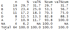
tabyl, from the janitor package
library(janitor)
tabyl(data$Type, sort = TRUE)
This is a pretty good start! By default, it shows counts, percents, and percent of non-missing data. It can optionally sort in order of frequency. It the output is tidy, and works with kable just fine. The only thing missing really is a cumulative percentage option. But it’s a great improvement over base table.
I do find myself constantly misspelling “tabyl” as “taybl” though, which is annoying, but not really something I can really criticise anyone else for.
tab1, from the epidisplay package
library(epiDisplay)
tab1(data$Type, sort.group = "decreasing", cum.percent = TRUE)
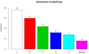
This one is pretty fully featured. It even (optionally) generates a visual frequency chart output as you can see above. It shows the frequencies, proportions and cumulative proportions both with and without missing data. It can sort in order of frequency, and has a totals row so you know how many observations you have all in.
However it isn’t very tidy by default, and doesn’t work with knitr. I also don’t really like the column names it assigns, although one can certainly claim that’s pure personal preference.
A greater issue may be that the cumulative columns don’t seem to work as I would expect when the table is sorted, as in the above example. The first entry in the table is “E”, because that’s the largest category. However, it isn’t 100% of the non-missing dataset, as you might infer from the fifth numerical column. In reality it’s 31.7%, per column 4.
As far as I can tell, the function is working out the cumulative frequencies before sorting the table – so as category E is the last category in the data file it has calculated that by the time you reach the end of category E you have 100% of the non-missing data in hand. I can’t envisage a situation where you would want this behaviour, but I’m open to correction if anyone can.
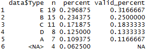
freq, from the summarytools package
library(summarytools)
summarytools::freq(data$Type, order = "freq")
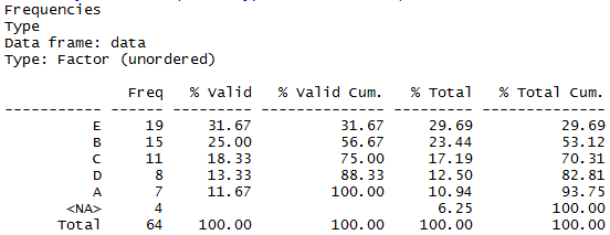
This looks pretty great. Has all the variations of counts, percents and missing-data output I want – here you can interpret the “% valid” column as “% of all non-missing”. Very readable in the console, and works well with Knitr. In fact it has some further nice formatting options that I wasn’t particularly looking for.
It it pretty much tidy, although has a minor niggle in that the output always includes the total row. It’s often important to know your totals, but if you’re piping it to other tools or charts, you may have to use another command to filter that row out each time, as there doesn’t seem to be an obvious way to prevent it being included with the rest of the dataset when running it directly.
Update 2018-04-28: thanks to Roland in the comments below pointing out that a new feature to disable the totals display has been added: set the “totals” parameter to false, and the totals row won’t show up, potential making it easier to pass on for further analysis.
CrossTable, from the gmodels library
library(gmodels)
CrossTable(data$Type)
Here the results are displayed in a horizontal format, a bit like the base “table”. Here though, the proportions are clearly shown, albeit not with a cumulative version. It doesn’t highlight that there are missing values, and isn’t “tidy”. You can get it to display a vertical version (add the parameter max.width = 1 ) which is visually distinctive, but untidy in the usual R tidyverse sense.
It’s not a great tool for my particular requirements here, but most likely this is because, as you may guess from the command name, it’s not particularly designed for 1-way frequency tables. If you are crosstabulating multiple dimensions it may provide a powerful and visually accessible way to see counts, proportions and even run hypothesis tests.
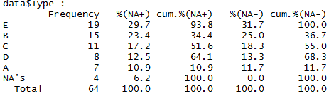
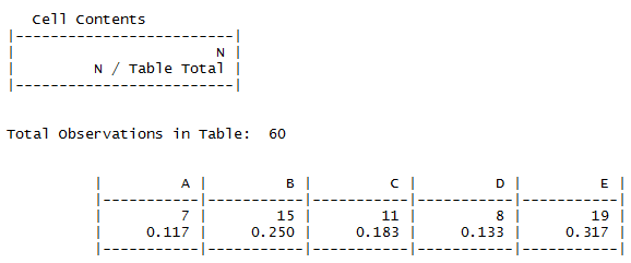
freq, from the questionr package
library(questionr)
questionr::freq(data$Type, cum = TRUE, sort = "dec", total = TRUE)
Counts, percentages, cumulative percentages, missing values data, yes, all here! The table can optionally be sorted in descending frequency, and works well with kable.
It is mostly tidy, but also has an annoyance in that the category values themselves (A -E are row labels rather than a standalone column. This means you may have to pop them into in a new column for best use in any downstream tidy tools. That’s easy enough with e.g. dplyr’s add_rownames command. But that is another processing step to remember, which is not a huge selling point.
There is a total row at the bottom, but it’s optional, so just don’t use the “total” parameter if you plan to pass the data onwards in a way where you don’t want to risk double-counting your totals. There’s an “exclude” parameter if you want to remove any particular categories from analysis before performing the calculations as well as a couple of extra formatting options that might be handy.

freq_tibble <- function(data, var1, var2) {
var1 <- rlang::enquo(var1)
var2 %
dplyr::count(!!var1, !!var2) %>%
tidyr::spread(!!var2, n, fill = 0) %>%
dplyr::mutate(Total := rowSums(dplyr::select(., -!!var1))) %>%
dplyr::bind_rows(dplyr::bind_cols(!!rlang::quo_name(var1) := “Total”, dplyr::summarize_if(., is.numeric, sum)))
}
LikeLike
As one moving into R from other packages–your post was brilliant & fantastic. Have you found a table that also outputs the value codes for nominal & ordinal categories–like the codes you’d see with an unclass function?
LikeLike
Hi,
Thanks for the compliments, I’m glad you liked the post!
Great question! I’m sorry to say that I’ve not seen (or at least noticed!) a function that outputs the value codes like that. I can certainly imagine circumstances where it’d be useful. Thanks for the thought.
LikeLike
Hi Adam, Thanks for the great analysis. I went with summarytools in my own analysis based on your blog.
Relative to your comment on summarytools always reporting the totals. Maybe this was added after your blog post, but summarytools includes options to remove the totals and nas rows from the output. For example, with totals and nas
> summarytools::freq(df$BTSP, order = “freq”)
Frequencies
df$BTSP
Type: Numeric
Freq % Valid % Valid Cum. % Total % Total Cum.
———– —— ——— ————– ——— ————–
0 99 49.50 49.50 49.50 49.50
1 53 26.50 76.00 26.50 76.00
2 33 16.50 92.50 16.50 92.50
3 11 5.50 98.00 5.50 98.00
4 3 1.50 99.50 1.50 99.50
5 1 0.50 100.00 0.50 100.00
0 0.00 100.00
Total 200 100.00 100.00 100.00 100.00
and without totals and nas
> summarytools::freq(df$BTSP, order = “freq”, totals=FALSE, report.nas = FALSE)
Frequencies
df$BTSP
Type: Numeric
Freq % % Cum.
——– —— ——- ——–
0 99 49.50 49.50
1 53 26.50 76.00
2 33 16.50 92.50
3 11 5.50 98.00
4 3 1.50 99.50
5 1 0.50 100.00
Maybe this would address your requirement for tidy data better.
Regards –Roland
LikeLiked by 1 person
Hi!
Thank you very much for your comment. This is great news – and does make the function fit my requirements even better as you noted. It looks like that feature was added in version 0.8.3 and I hadn’t checked back so thanks for bringing it to my attention 🙂
Cheers,
Adam
LikeLike
I really enjoy your great post about “how to”…There is a link in some part of them to download the “data” and then make easy to follow all the examples?
Thanks for your effort and magnificent work!!!
LikeLike
Absolutely brilliant. Thanks for posting this.
LikeLike
Awesome blog! Thanks for sharing this. I wonder if I could use summarytools::freq for a group of variables? Thanks!
LikeLike
Yes, you can give it a data frame and it’ll work on just the factors.
LikeLike
Thanks so much for providing this!
LikeLike
Thanks for this post. I came here looking for a summary function that can work with weights ( weighted frequencies when working with grouped tables) while including the NA values in percentage counts. Only summarytools::freq has the weights option but does not include NA’s in percentage counts.
From your example
In summarytools::freq, E shows only shows valid% 31.67%
while in questionr::freq it, E shows both % 29.7 and val% 31.7
LikeLike
Please advise which R-package can detect outliers in the transit (migration) matrix
LikeLike
Perhaps the tableone package is worth a mention here?
LikeLike
Wonderful post! Thanks for writing it. I’ve been using the jmv package that does the calculations for the jamovi gui. It combines frequency tables and descriptive stats in a single function. Its contTables function does contingency tables with lots of additional measures like odds ratio, relative risk, etc. However, there’s no R Markdown yet. That’s on their to-do list though.
LikeLiked by 1 person
Hello Bob,
Very interessing information !
Could you let me know if there is any R package working on Rmarkdown that combines frequency tables and descriptive statistics in a single function?
Many thanks,
Laura
LikeLike
Hi,
Not sure if this is quite what you’re looking for, but these days I have been using `tbl_summary` function of the library [gtsummary](https://www.danieldsjoberg.com/gtsummary/index.html) as a function that covers at least simple frequency tables and descriptives. By default it shows the descriptives for the groups you define as your grouping columns although there’s an `add_overall` function if you want the overall descriptives for the whole sample. It works well with Rmarkdown where you have a lot of control over the format – especially as you can convert it into a [gt](https://gt.rstudio.com/) object if you want to do advanced customisation – but probably doesn’t have all the features of the jmv package `contTables` version.
The same package has a dedicated cross tables function `tbl_cross` although that would not do any descriptives.
(I should probably update this post one day!)
LikeLike
Great post. Just noting that if you use tabyl::janitor and want to get percentages for two columns, you can use adorn_percentages() a la:
mtcars %>%
janitor::tabyl(am, gear) %>%
janitor::adorn_percentages()
LikeLiked by 3 people
Hi, is there an easy way to do this with dplyr?
LikeLike
Hi – you can indeed make a frequency table using dplyr with just a couple of functions.
Using data similar to the above, something like:
data %>%
group_by(Type) %>%
summarise(frequency = n())
should do the basics.
If you want percent of totals, I occasionally find myself doing something like:
data %>%
group_by(Type) %>%
summarise(frequency = n()) %>%
mutate(pct_of_total = frequency / sum(frequency).
Hope that helps!
LikeLike
thank you!
LikeLike
Hi- do you have a suggestion to create cumulative proportion column for multiple columns at once?
LikeLike
Hi there, sorry for the slow reply, and thanks for reading and commenting!
When you say cumulative proportion for multiple columns, could you give an example of the sort of output you’d want? It’s hard for me to imagine how one would display multiple different cumulative proportions in the same table – if that’s what you meant, my apologies if I’m misunderstanding.
LikeLike