Last week, secondary schools in England reopened for all pupils, after several months of semi-closure due to the Covid-19 pandemic. During that period, most teachers were busy labouring hard to conduct their lessons remotely, often persevering with minimal extra resources and inconsistent central guidance.
A smaller proportion were still going to school, in order to supervise vulnerable students and the children of any essential workers who could not work from home home. They worked in-person, alongside the extensive support staff of technicians, administrators, maintenance workers and support staff that schools require to operate even at reduced student capacity.
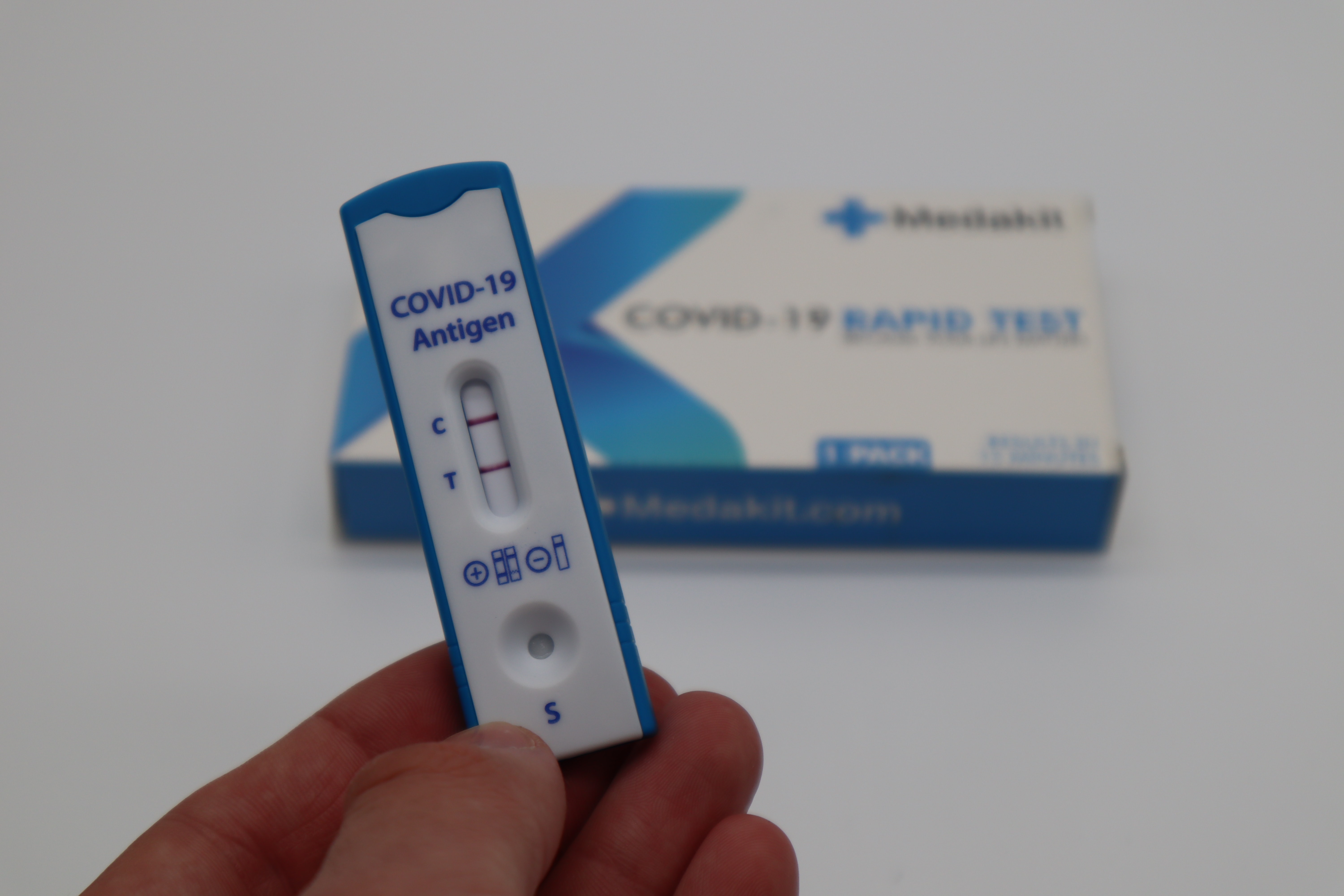
As of last week though, the plan is for everyone – staff and students – to physically attend school. Unfortunately the Covid-19 plague is still amongst us, so several measures designed to reduce the chance of mass Covid infections have been put in place. One such measure is the regular testing of staff and students, using Covid-19 lateral flow tests. In the current phase, staff and students are being tested 2-3 times a week at school, with any positive results resulting in a requested isolation of the person concerned and whoever they’ve been in contact with.
This lateral flow testing has in fact been going on some time for the folk who had the need to physically be at schools, albeit with changing policies over time and some amount of controversy over how they’re being used. So, especially self-interested as I am in a household with exposure to secondary schools, I was curious to see how it’s been going so far, as well as try and make some sense of curious claims, such as that the actually-testing-positive rate is substantially below even the false positive rate of the tests themselves.
According to the latest NHS test-and-trace figures, just 0.24% of lateral flow tests conducted in the week ending 24 February found positive cases – a figure so low it is actually below the 0.32% “false positive rate” for these tests.
School Covid tests: positive results ‘very likely’ to be false, The Guardian
Sidenote: if anyone else out there is, like me, in a household or bubble with a school staff member or student, you are eligible for regular lateral flow testing yourself. Follow this link to find out how to get involved if you’re not doing so already.
How many tests have been done so far?
The best data I found that specifically concerned tests conducted in secondary schools was in table 7 of the “Tests conducted” datafile published as part of the “Weekly statistics for NHS Test and Trace (England)” release. The table is titled “Number of tests for Covid-19, Lateral Flow Device (LFD) tests in secondary schools, by staff and students”. At the time of writing, the most recent file is part of the 3rd of March 2021 release.
It’s important to note that whatever conclusions one might determine from the contents file might not necessarily hold for what comes next, as only a (non-randomised) fraction of England’s secondary school pupils, teachers and other school staff were at school being tested in person during that period. Most others were – hopefully – safely locked down, working from home, to try and reduce spread. For staff, my understanding is that typically only those that were required to physically be at school for some reason were being tested. This likely means meaning that fewer teachers were present than usual as they were endeavouring to support their students from home, so certain types of support staff may be over-represented in these tests vs the typical makeup of a school’s staff. And any effect of having all students and staff physically in school, trying to get on as near to normal as possible given the conditions, are by definition not going to be visible in this data.
But we can only work with what we have right? So let’s start with seeing how many lateral flow tests have been conducted in schools so far – or at least up to the week commencing February 25th 2021, which is the latest data available at the time of writing. Note again that at this point, most students and a lot of staff were still not routinely attending school, or having these tests.

The count of tests conducted has been rising over the weeks, with the exception of a dramatic but predictable drop during the weeks affected by the half term holidays. Most schools went on half term for a week from February 12th, although there will likely be some variation between schools on that. In the last week of data available, post-half-term, a new high of 622,861 tests took place.
The test data available can be broken down by whether the testee was a student or a staff member. For the current published data, this has actually been done by classifying people based on their age. Presumably they’re collecting birth date or similar, but not logging a specific staff vs student indicator. This does have a slightly odd side-effect in recent times – since March 1st people like me have become eligible for at home testing, by virtue of being in the same household as a teacher. If I understand correctly, then due to my age I will be classified as “staff” in this data at present, at least until they enact their plan to separate out us non-school folk into our own category. However, as this data only goes up to March 3rd at present, this won’t be an issue for the large majority of data shown.
Anyway, here’s the breakdown as reported:

The testing so far has been dominated by staff testing for the most part, again as only students who had to go physically into school for reasons deemed essential would have been involved. In reality, there are far more secondary school students than staff, so now everyone is supposed to be back at school, this relationship can be expected to reverse.
To give some idea of the numbers involved, it looks like that in 2020 there were about 3.4 million secondary school students in state funded schools. On the staff side, a total headcount of around 408k staff are involved, with just over half actually being teachers. So, assuming a reasonably high participation rate within staff and students, we will be seeing many millions of tests per week, the large majority for students. Leading up to the full open though, it was only in the most recent week that we saw the number of tests given to students reach the volumes given to staff.
Test results so far
So what were the results of the tests? We should note that the publishers are keen to point out that there may be many data quality or interpretation challenges with these numbers. These include the fact that it relies on the test being taken correctly, the results being reported correctly, that each person is likely to take several tests so they are not independent of each other, test frequency can vary across settings and so on. These mean that any figures produced are not necessarily suitable to calculate an overall positivity rate that can be compared to other methods, times, populations or categorisations.
One obvious bias here might be that if you are found to be positive then you’ll be sent home home to isolate for a while. You’ll thus likely not receive your next in-school intra-week test, whereas your contemporaries who tested negative will do.
This is in addition to the fact that the lateral flow tests themselves aren’t perfect. No tests are, but lateral flow tests appear to optimise factors like speed and ease over accuracy when compared to other technologies such as PCR tests. We may come onto this more later, but a recent statement from the Royal Statistical Society used a value of only 40% for sensitivity (taken from the results of a Liverpool Covid-19 community testing pilot – which to be fair seems like it was lower than had been expected) and 99.8% for specificity. This means that, taking their figures at face value, if you have Covid-19, there’s only a 40% chance the test will correctly say you do. If you don’t have the disease then there’s a 99.8% chance that it’ll correctly say you don’t.
Anyhow, with all those caveats, let’s peek at results of these lateral flow tests? After all, accurate or not, it’s the results they produce that are going to govern what the subjects are asked to do.
Over the whole dataset, we see 99.7% of tests came back negative for Covid-19. Around 0.12% came back positive and 0.18% came back as unknown or void.
Here’s the positive and void rates per week.
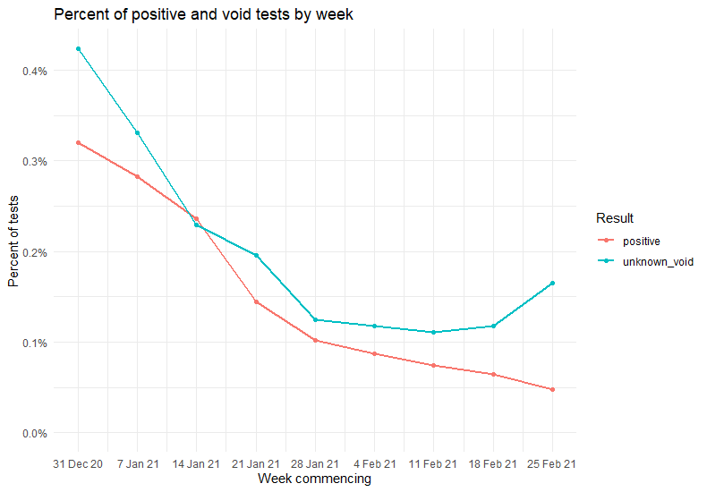
So in general, the percentage of positive results declined over time, as did the unknowns; at least until the most recent weeks. What it feels like it may be important to know here, and indeed important to know to interpret much about the latest datapoint, is that from 25th February 2021, secondary staff began to transition to testing themselves and reporting from home. Could something in that process have increased the % of tests with unclear results?
Actually it doesn’t seem that that is the main driver of slightly increased void rates. The effect is more noticeable in students than staff, with the former still being tested at school.

We noted above that the last week of this dataset showed a greatly increased volume of testing done on students vs prior weeks, so another hypothesis could perhaps also be formed around that.
Switching the above chart so that the colours represent the participant category and the facets represent the test result, we can also see that most weeks the tests on students were more likely to come back positive or void than those conducted on staff.

As noted above, far more tests to date have been done on staff than on students, and the majority of student tests were done in the most recent weeks. If we look at tests from all time periods combined, then 0.12% of staff tests were positive vs 0.14% of student tests. And 0.14% of staff tests were void, vs 0.26% of student tests.
During this time though of course it’s very likely that the background rate of the disease- what percentage of the population actually has Covid – changed. Note also that the students would also typically have been those whose parents are essential workers working outside their home, or are in some other way vulnerable enough to need to be at school, which may influence the chance that they contracted Covid-19 compared to the ‘average’ student.
Positive tests vs the false positive rate
So now, what about the claim from the Guardian article that the proportion of positive cases found is below the number that would expected purely from false positive results. That does sound odd at face-value , outside of some pretty hefty reporting bias – which certainly isn’t impossible, but also would be, let’s say, far from ideal.
The precise claim was that “just 0.24% of lateral flow tests conducted in the week ending 24 February found positive cases – a figure so low it is actually below the 0.32% “false positive rate” for these tests“. So I’ll examine something similar, specifically for the most recent week of secondary schools data test available above.
Note that what I go through below is going to make a plenty of somewhat unrealistic assumptions. I’m not an epidemiologist and we’ve already acknowledged that the data may not be of ideal quality. But I wanted to experiment with some kind of approximation to see the nature and size of that sort of apparent discrepancy, if it does appear in the recent secondary schools data. Suggestions and corrections are very welcome, and most certainly no-one should be making any decisions based on the below.
Perhaps my primary unrealistic assumption is going to be that we live in a world without Covid-19 🙂 . A joyful assumption indeed. But my theory was that if the figures show that the count of positive cases is unfeasibly low even if we pretend that no-one anyone actually has Covid-19, then that would seem odd, right? This should produce a kind of extreme-low baseline of expectation, given that the presence of people who do actually have Covid can only drive these figures up.
Next up, I’m going to take just the most recent week’s data, and remove the voids. This has an implicit assumption that the reported voids are equally as likely to have been positive cases as negative cases, were they not have been void. I would assume that’s not necessarily true, but I don’t feel able to quantify what the difference would be. So, taking a lead from the spherical cow physicists, I’m just going to simplify by removing them.
This leaves us with a total of 621,830 tests taken, where 297 ended up with a positive result. So the proportion of tests reporting that the participant tested positive of Covid-19 was around 0.05%.
If we take the Guardian article’s 0.32% false positive rate verbatim and combine that with my uber-optimistic assumption that literally no-one has Covid-19, then how many tests would we have expected to come back positive? In this scenario, it’d simply be 0.32% of 621,830, which is around 1,990 people.
Hmm…1,990 does seem rather larger than 297. But let’s remember that the false positive rate in reality operates at a per-test level. If we do 10,000 tests on uninfected people we are not guaranteed to see exactly 32 of them come back positive, right? The idea is more that each individual test has a 0.32% chance of coming back positive if the participant doesn’t have Covid-19. Sometimes a few more will, sometimes a few less will.
The more interesting question here then is: how unusual is it that, given a 0.32% false positive rate, we would see only 297 tests come back positive? Remembering here that we’re being as generous as possible in assuming that no-one actually has Covid-19. Whilst this is an attractive proposition, I must make pains to point out it is not true. Keep wearing your masks!
So how unlikely is it? There’s many ways one could approach that question. Here I’m going to use a simulation. I’ll model the positive test result from a test as having a Bernoulli distribution and simulate 621,830 tests each with an individual probability of 0.32% of being positive, i.e. the false positive rate – recalling that here we are pretending there’s no chance of a true positive result for Covid. As the Bernoulli distribution is a special case of the binomial distribution, in R we can do this with a quick deployment of the rbinom() function.
rbinom(n = 621830, size = 1, prob = 0.0032)
That gives us a sequence of 621830 0s and 1s, with the 1s representing the simulated positive test results. We can then sum up that sequence of that to see how many positive cases came out of this simulation. It’s really just like flipping 621,830 extremely biased coins and counting the heads.
The first time I did this I got a simulated 2011 positive cases. This is fairly similar to our expected 1990 from above, and much less similar to the actually observed 297. However, one simulation doesn’t tell us much about the likely range of values, so let’s do more. In fact, let’s repeat the whole thing 5000 times – 5000 parallel universes where 621,830 Covid-19 tests took place independently- and see what sorts of values pop up.
The distribution of the count of positive tests in a given simulation (x axis) vs number of simulations that produced that count (y axis) is shown in the histogram below.
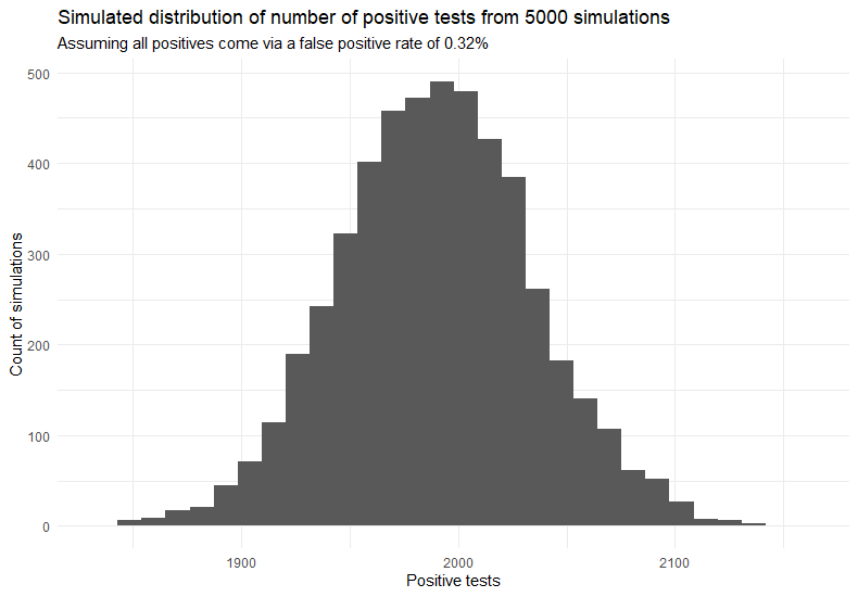
We get a fairly normal-looking distribution of results – thank you central limit theorem. It’s got a mean value of 1990 positive cases – almost exactly our expected value from above – and a standard deviation of around 45 cases. The smallest number of positive cases that any of these 5000 simulations came back with was 1839. Which is a far above the apparently observed 297 cases, as illustrated below.
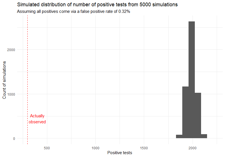
From the simulation we’d expect results to be in the region of the grey histogram bars. The results reported in the schools data are indicated by the dotted red line. So I think we can safely say that, if we are OK with the manifold sometimes dubious assumptions outlined above, then even in a world with zero Covid it’s extremely unlikely that we’d see only 297 positive results from around 622k tests.
So what’s going on? Are the assumptions flawed enough to create this difference? Is there bias or misreporting of results on a scale that could result in this? Well both are potentially possible, but a simpler, perhaps least conspiratorial, reason could be that the 0.32% false positive rate may not actually be correct.
False Positive Rates are by their nature uncertain, and may be refined over time as more data becomes available. After all, they have to be derived experimentally. There’s also the question as to what do you compare the lateral flow test to in order to decide whether the positive is actually true or false, especially with a disease that can occur with no symptoms? Usually in this case it has been a PCR test, but they themselves are likely not absolutely perfect. Rates might also be affected by the circumstances in which the tests are being done – maybe the way a trained technician conducts the test results in a lower FPR than a 12 year old school kid attempting to do the same thing.
A recent analysis published on March 10th suggests that the false positive rates of these lateral flow tests is actually a lot lower than 0.32%. That report, coming from a phase 4 study of 7,546 participants with a negative PCR result, claims a specificity of at least 99.9%, maybe as high as 99.97%. This would reflect a FPR of 0.1% and 0.03% respectively. The latter result is an order of magnitude below the 0.32% we were simulating above and would suggest if 1000 lateral flow tests were done then there would be less than 1 false positive result on average. There certainly remains some uncertainty, with table 2 of the same report showing false positive rates from other studies ranging from between 0.06% and 1.88%. But let’s see what happens if we assume the values the researchers in this particular study claim likely.
Starting with a false positive rate of 0.1%, and running another 5000 simulations:

So here we get a mean average positive test count of 622 . Still more than twice than what was observed, albeit a lot closer than the original simulation where we used a 0.32% FPR. The lowest count simulated was 527 – so 297 is still an extremely unlikely low number of tests to come out positive.
Next up let’s use a FPR of 0.03%, the one corresponding to the researcher’s “specificity could be as high as 99.97%” claim.

Here the average simulated positive test count was 186, with a standard deviation of 14.
Now we see that the 297 positives shown in the data was very unusually high, if in reality the FPR was 0.03% and all our positive cases were down to false positives. The maximum number of positive cases found in any of the 5000 simulations here was 238, substantially below the 297 actually observed in the data.
Of course the sad but true reality is that a certain amount of positive test results will reflect genuine positives, something that’s not involved in the perfect Covid-free world simulated here. So the above result would at least be logically compatible with reality, at least in the contrived way we defined reality here.
As the expected positive case count from a given number of tests in a Covid-free world is proportional to the false positive rate, it’s easy enough to plot a chart showing how differing FPRs should affect the expectation of positive cases found. Assuming the same volume of tests as we saw in the most recent week’s secondary school data, here’s what we’d expect in our perfect world

If we look at the intersection of what was actually observed in terms of positive cases and our black line showing the relationship between FPR and estimated cases, that gives us an idea of what the FPR would mostly be like in a world where there was no Covid – assuming that the last week’s secondary school data was representative of the true values involved, with no reporting bias or other shenanigans that would artificially skew the case count. In that case, the most likely value for the false positive rate would be somewhere around 0.04 – 0.05%.
If only we lived in that world! As we don’t, and Covid-19 is continuing its onslaught, the FPR would likely have to be lower to make it likely we’d see what we did. If we allow a version of the assumptions above, then what is reported does seem compatible with the lower threshold for FPR in the March 10th report linked to above, but not so much with many of the false positive rates determined in several studies prior to that one.
