Most people trained in the ways of data visualisation will be very familiar with Anscombe’s Quartet. For the uninitiated, it’s a set of 4 fairly simple looking X-Y scatterplots that look like this.
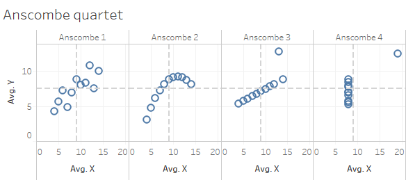
What’s so great about those then? Well, the reason data vizzers get excited starts to become clear when you realise that the dotted grey lines I have superimposed on each small chart are in fact the mean average of X and Y in each case. And they’re basically the same for each chart.
The identikit summary stats go beyond mere averages. In fact, the variance of both X and Y (and hence the standard deviation) is also the pretty much the same in every chart. As is the correlation coefficient of X and Y, and the regression line that would be the line of best fit if were you to generate a linear model based on each of those 4 datasets.
The point is to show the true power of data visualisation. There are a bunch of clever-sounding summary stats (r-squared is a good one) that some nefarious statisticians might like to baffle the unaware with – but they are oftentimes so summarised that they can lead you to an entirely misleading perception, especially if you are not also an adept statistician.
For example, if someone tells you that their fancy predictive model demonstrates that the relationship between x and y can be expressed as “y = 3 + 0.5x” then you have no way of knowing whether the dataset the model was trained on was that from Anscombe 1, for which it’s possible that it may be a good model, or Anscombe 2, for which it is not, or Anscombe 3 and 4 where the outliers are make that model sub-par in reality, to the point where a school child issued with a sheet of graph paper could probably make a better one.
Yes analytics end-users, demand pictures! OK, there are so many possible summary stats out there that someone expert in collating and mentally visualising the implication of a combination of a hand-picked collection of 30 decimal numbers could perhaps have a decent idea of the distribution of a given set of data – but, unless that’s a skill you already have (clue: if the word “kurtosis” isn’t intuitive to you, you don’t, and it’s nothing to be ashamed of), then why spend years learning to mentally visualise such things, when you could just go ahead and actually visualise it?
But anyway, the quartet was originally created by Mr Anscombe in 1973. Now, a few decades later, it’s time for an even more exciting scatterplot collection, courtesy of Justin Matejka and George Fitzmaurice, take from their paper “Same Stats, Different Graphs“.
They’ve taken the time to create the Datasaurus Dozen. Here they are:

What what? A star dataset has the same summary statistics as a bunch of lines, an X, a circle or a bunch of other patterns that look a bit like a migraine is coming on?
Yes indeed. Again, these 12 charts all have the same (well, extremely similar) X & Y means, the same X & Y standard deviations and variances, and also the same X & Y linear correlations.
12 charts are obviously more dramatic than 4, and the Datasaurus dozen certainly has a bunch of prettier shapes, but why did they call it Datasaurus? Purely click-bait? Actually no (well, maybe, but there is a valid reason as well!).
Because the 13th of the dozen (a baker’s dozen?) is the chart illustrated below. Please note that if you found Jurassic Park to be unbearably terrifying you should probably close your eyes immediately.
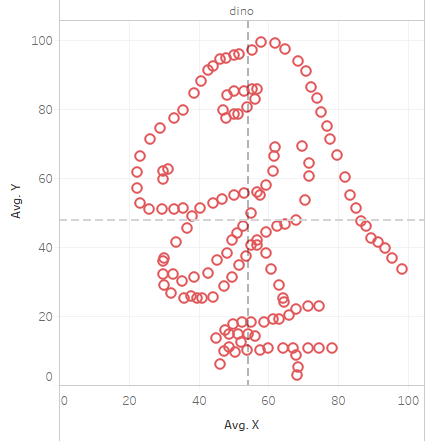
Raa! And yes, this fearsome vision from the distant past also has a X mean of 54.26, and Y mean of 47.83, and X standard deviation of 16.76, a Y standard deviation of 26.93 and a correlation co-efficient of -0.06, just like his twelve siblings above.
If it’s hard to believe, or you just want to play a bit, then the individual datapoints that I put into Tableau to generate the above set of charts is available in this Google sheet – or a basic interactive viz version can be found on Tableau Public here.
Full credit is due to Wikipedia for the Anscombe dataset and Autodesk Research for the Datasaurus data.

One thought on “The Datasaurus: a monstrous Anscombe for the 21st century”